Visually streamlining a products icon set
Bringing consistency and craft to a patchwork icon library
Learnosity is a white-label assessment platform powering some of the world’s leading learning products. As part of establishing the foundations of the Learnosity design system, the existing icon set needed a full audit and redesign to function as a cohesive, scalable library.
Brief
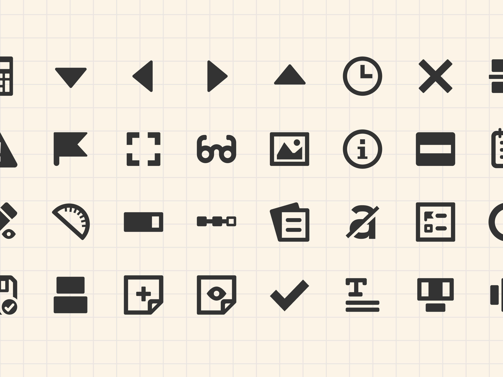
Icons at Learnosity had accumulated organically over time. Designers would find something on online tools or in icon fonts for a specific use case, drop it in, and move on. The result was a toolbar full of a mish mash of icon styles, inconsistent stroke weights, varying levels of detail, mismatched visual styles. Some icons were also poor metaphors for what they actually did, which made the UI harder to use.
With 39 icons to address and three other designers on the team who would need to create icons going forward, the project had two equally important deliverables: a polished, consistent icon set and the documentation to help designers create icons to add to it in future.
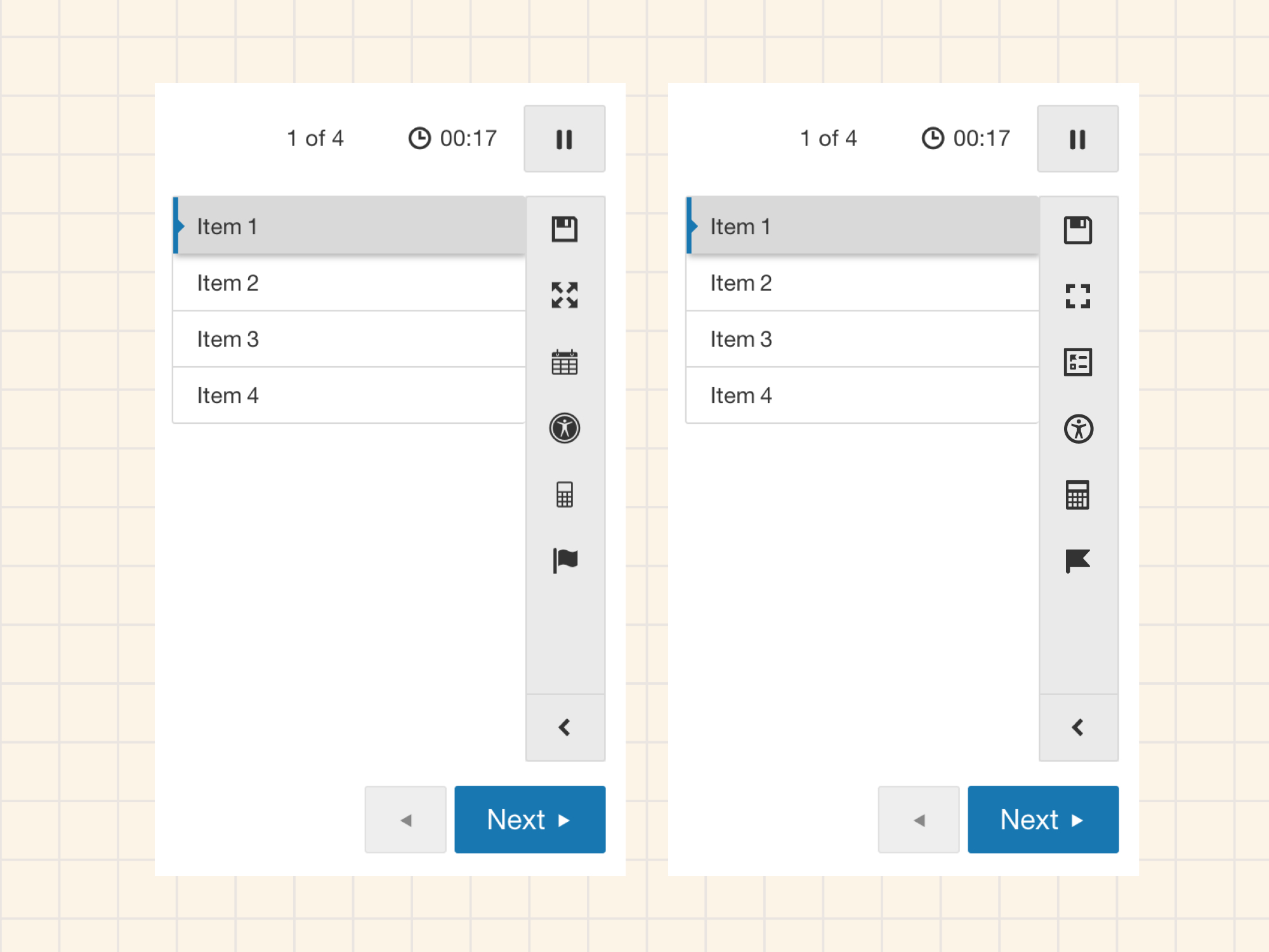
The audit
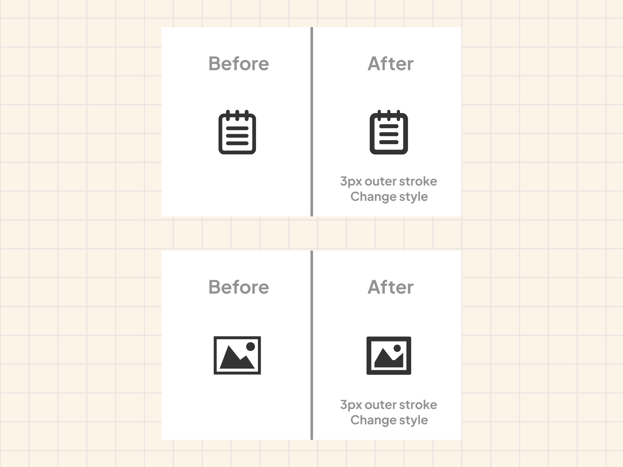
The first step was reviewing every icon against the same set of criteria: visual consistency, stroke weight, legibility at small sizes, and whether the graphic actually communicated the right concept. Each icon fell into one of two categories. Some needed visual cleanup only: bringing stroke widths into alignment and tidying up shapes while keeping the same glyph. Others needed the graphic replaced entirely because the original choice was either too literal, too decorative, or a poor match for the meaning.
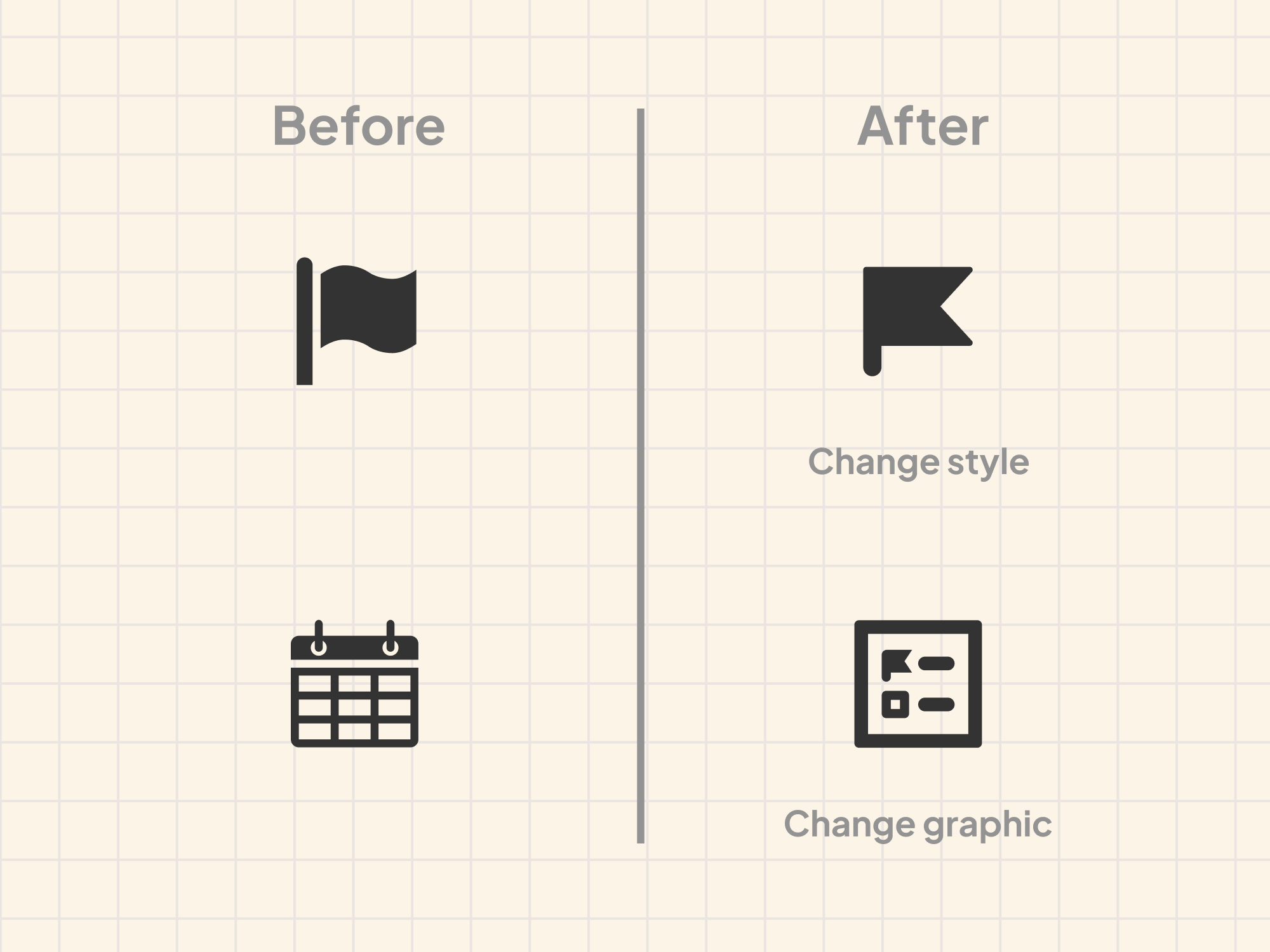
The calendar icon is a good example of the second type. It had been used to open a panel showing questions a student had flagged to review, but a calendar graphic has nothing to do with that job. We replaced it with a custom icon that combined a simplified flag glyph with a panel shape, connecting it visually to the flag icon already used in the interface to mark questions. The two icons now reference each other, making the relationship between marking a question and finding it again much easier to read.
Naming
Part of the work was also rethinking how icons were named. The previous convention tied names to use cases, so an icon might be called something like “review-panel” or “flag-question.” The problem with use-case naming is that it locks an icon to a single context. If the product evolves or the icon gets reused elsewhere, the name becomes misleading or has to be duplicated.
The new convention names icons for what the glyph shows, not what it does. A bookmark is called bookmark. An exclamation in a circle is exclamation-circle, not error or alert. This makes the library more flexible and easier to consume, and it aligns with how most mature icon systems work.
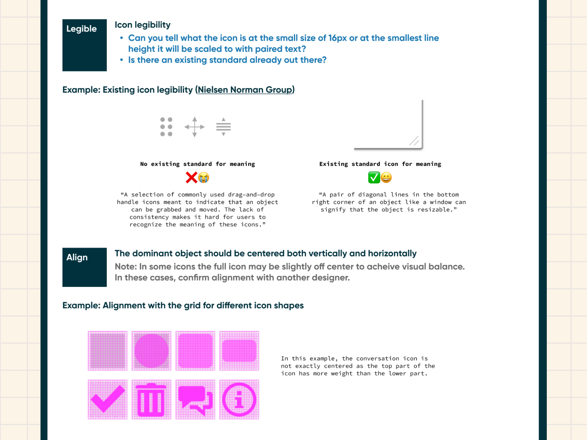
Guidelines and documentation
With three other designers on the team who would be adding icons over time, documentation was critical. I wrote easy to follow instructions covering the icon grid, stroke width rules, color, legibility principles, alignment, and naming conventions. A companion guide walked through the end-to-end process for creating and publishing a new icon, from copying the template frame in Figma through to exporting SVGs, creating the engineering ticket, and updating the library version.
The goal was that any designer on the team could create an icon that fit the set without needing to ask me how.
Outcome
39 icons published to the design system Figma library and exported as SVGs for the engineering package, with one additional icon in review. The icons replaced the existing set in the product UI as part of the broader design system rollout.