Testing Figma components to improve quality
A lightweight research program for actionable improvements in beta
Project Overview
The design system’s Figma components had a beta period, but we hadn’t established a structured way to test them. Since designers typically don’t adopt new components mid-project, we had limited feedback. The team creating these components needed aligned principles to communicate their design decisions effectively.
The Problem
The design tools team was creating Figma versions of the new composable components, but each designer had their own approach. They faced challenges pushing back on the composable working group about how closely the Figma component needed to match the actual component. Figma is a presentational tool with different needs and constraints than code. The designers needed agreed-upon principles for when to diverge and when to match exactly. Components had a beta period, but we weren’t testing them proactively. We needed to know if designers could actually do what we expected them to do with these components. Testing would give us insights we could apply to future components and help the team align on their approaches.
Getting Started with a Pilot
I started by working with one of the designers on the team. We agreed it would be valuable to test, so we started with the Pill and Pill Group components. We found people we knew who were advanced and beginner Figma users and set up a database to track the research. The sessions were facilitated, so he ran them while I helped design the test activities and synthesize the recordings.
The test included three to four tasks, from basic to more complex, where the designers needed to achieve a common use case. We recorded the sessions and reviewed them for synthesis. Being just the two of us made it quick to get done and gave us an initial example to show other collaborators.
The pilot showed it was a viable testing method. Could we do it lightweight without taking up too much time? Was the information we were getting worth it? Yes and yes.
Refining and Making it Reusable
Once we had the pilot example, we formalized the project with the team’s researcher. They made sure we ended up with comparable data to provide useful insights at the end and that we limited the scope to our main priorities, base usability and component specific feature use. For example, defining what “usability” actually meant for these tests. Also testing specific things the Figma component designer wasn’t sure about, like using image fill for backgrounds or how to set up showing and hiding pills in a pill group so the consumer could benefit from the correct layout being available without detaching the component.
The initial test didn’t have formally documented goals and prioritization. The later tests got more comparable results because they were more rigorous and targeted. It was easier to design activities because we had clearer scope and wouldn’t include something if it didn’t directly align to one of those goals. The information from the initial test still provided a lot of value but now we had a repeatable testing method that would provide us high-quality data.
Using Unmoderated Testing
In planning for the test, I knew usertesting.com was available through our tools and thought it would be a perfect tool to leverage for the activities. During the facilitated pilot sessions, the component designer was active in the session and present in the video meeting. There was a sense that the participant felt pressure or didn’t want to sound like they didn’t know what they were doing. They weren’t trying everything they might try if they were working on their own.
Unmoderated testing gave us flexibility on getting people to participate but also gave us a more realistic view of how they’d work in a normal setting. We could see how hard they’d try before giving up and be more honest with their feedback.
Designing the Tests
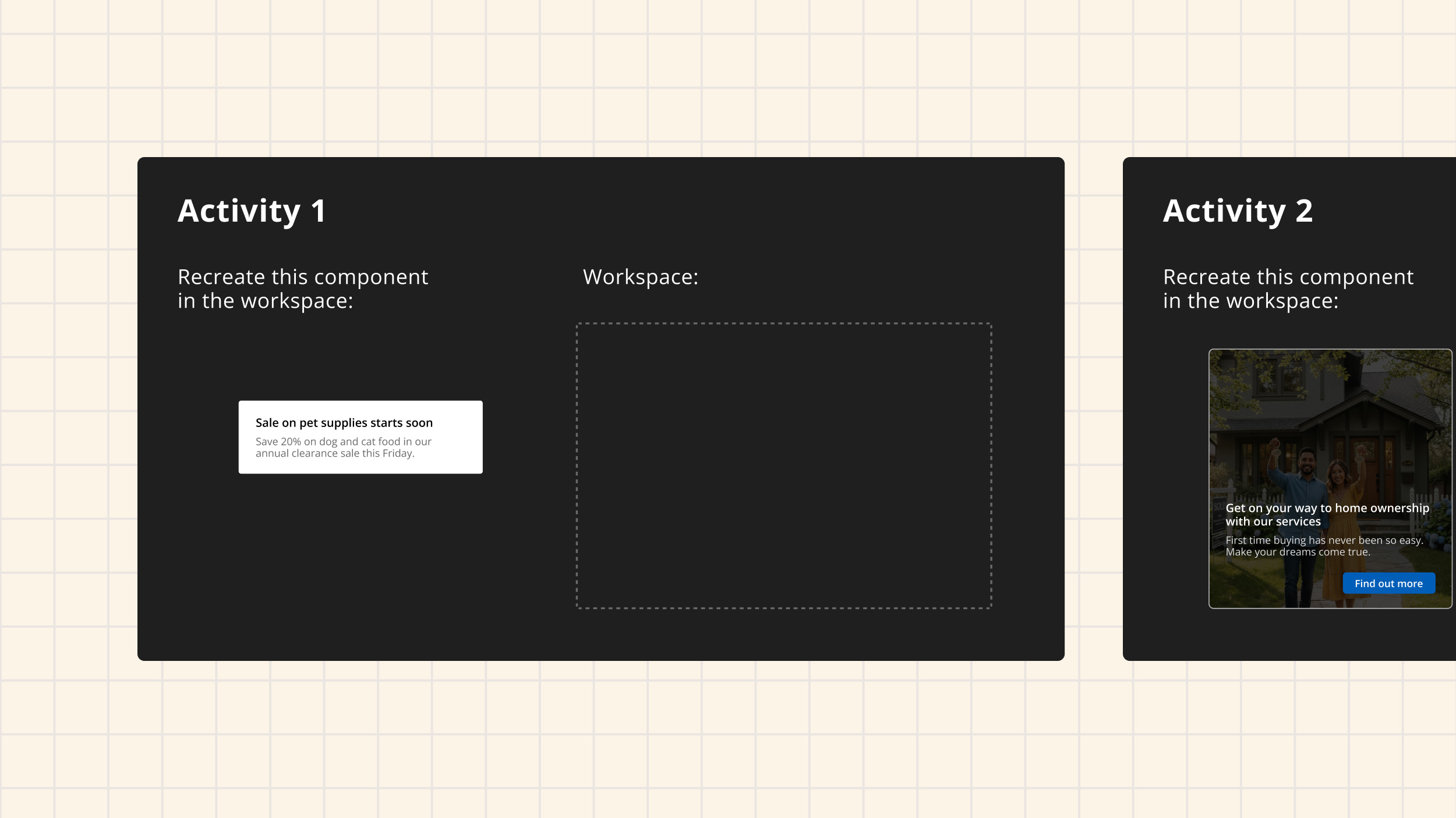
Tasks started simple and got more complex. The designer would be given an image of what they needed to achieve and the parts they could use. One example was a Tile where the initial Tile was something they could do out of the box with a simple header and description. The next task would add one complex element, like adding an icon next to the header. They’d need to swap in a component.
The last task would be most complex with multiple steps. For example, the way the composable Tile was using subcomponents within a Tile Container component. To make the inverse version of the Tile, they had to change a property on each piece and add a background image. The question was: will they understand how to do that and look in each component to make it match the example? And will they know to use the background image feature and which layer in Figma to add it to?
We scored each task as pass, fail, or something in between. A pass meant they adequately did what was in the activity. Tests were suggested to take 20 minutes total, but that was just a suggestion with no time limits. A lot of people would give up at a certain point, and that told us how hard they’d try before not wanting to use it. Something in between would be when the visual they ended up with looked correct but the way they went about it was wrong, which might impact how a developer would interpret it.
Synthesis and Insights
We watched all the videos, took notes, and scored based on pass or fail and why. We noted patterns. From that, we did a collaborative synthesis workshop to run through all the notes from whoever watched the videos. We made sure multiple people on the team watched so we all had potentially different perspectives on why something was happening.
The workshop included people who designed the coded component, people who designed the Figma component, the researcher, and the two managers of the component design team and design tools team. The nice thing was the researcher was less familiar with Figma capabilities, so we really had to make everything make sense clearly to move forward with what the insight was.
In the workshop we took all our synthesis notes and found patterns in them, clarifying what we thought happened and why, then aligning on the insights and how they would impact the design approach going forward. Sometimes it included acknowledging we didn’t get a definitive answer.
After the workshop, we had key findings that we put into a presentation in Figma. We made sure to include what actions we’d take, or had taken, and what the guideline would be.
Creating a Reusable Method
The reusable testing method had a document that clarified priorities and had areas to fill in component-specific questions we wanted to answer. It was super easy to fill out because it asked what you’re trying to do in a very simple way and could be easily applied to another component.
The test files in Figma had a template that was easy to navigate for participants. It could be duplicated and reworked for the next component. All you had to do was design the image examples that the participant would reference and try to recreate. We had plenty of common use case examples to pull from in the component design discovery research.
The synthesis work had a template which was a virtual whiteboard in FigJam. The final presentation could be repurposed for the next component and had a very clear structure that presented what we did, what we saw, what we learned, and what actions we were taking.
Impact
After we delivered findings and recommendations, the designers made a lot of fixes before releasing components out of beta. It was really cool to see the insights used so quickly. There wasn’t pushback because the designers were involved in the whole process and saw for themselves why we should make changes. To solve issues we saw but were technical constraints in Figma, we discussed different solutions like instructional videos or including guidance in the metadata and property panel text.
Within a few weeks, we were testing other components and had a clear backlog. We tested many components including the Pill, Datepicker and Tile using subcomponents. What we were doing was a novel approach for the organization for research with internal tools or employee-facing applications.
The impact was clear guidance starting to emerge for future component designs. It also helped the designers creating these components realize they don’t need to make decisions in a vacuum. They could test things out, get the answers they needed, and feel confident about their decisions.
Reflection
This project went as well as it could have. Highly collaborative, super lightweight, really quick to get off the ground, and highly actionable insights. My proudest moment was seeing what all my collaborators got out of the research synthesis, finding things that would help them in all sorts of areas of how we deliver the design system. The biggest win was when we synthesized something into an actionable insight, felt super confident in it, and had research showing the why.
I learned that you just have to try things and be efficient. If you don’t try stuff, you don’t even know the value you can get out of it. From a design system perspective, we can make better decisions by quickly putting things in front of our customers. This beta testing was a quick way to really increase the quality of the output for our users and make our future process better and more efficient at delivering high-quality outputs.