Modernizing a design system at scale
Shifting a design system from monolithic components to composable building blocks
Project Overview
I joined the design system team at a critical moment. The organization had standardized on modern tech platforms (React, Jetpack Compose, SwiftUI), but the design system was still built on legacy components from five years earlier. These “swiss army knife” components tried to do everything, creating bloat, bugs, and friction for product teams. The transformation from a rigid system to a flexible, composable model would impact thousands of designers, developers, and hundreds of product teams.
The Problem
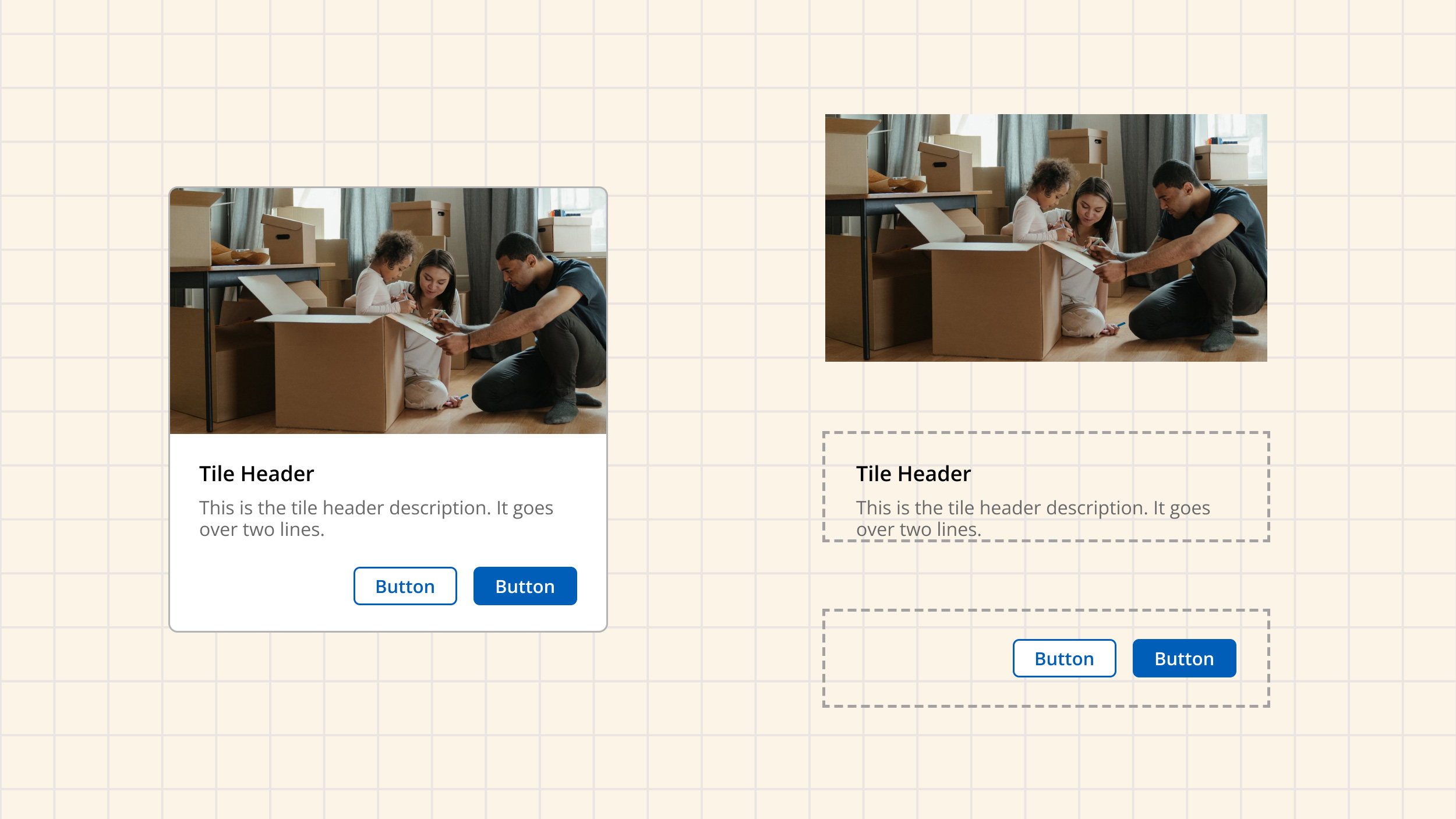
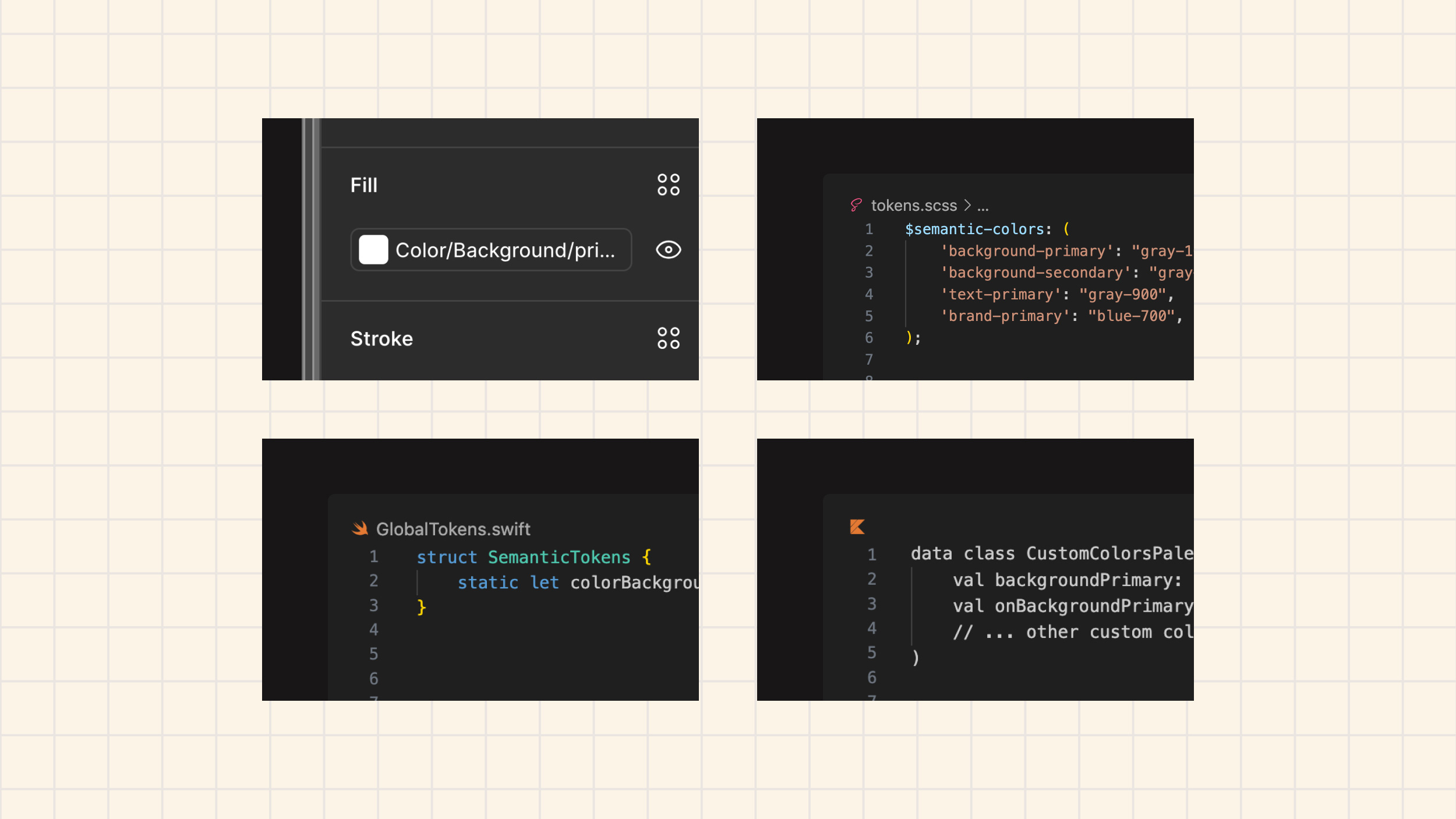
The system had been built quickly to get teams off a legacy platform, which meant some trade-offs. Components tried to handle many use cases at once, which made them complex to use. A Tile component that supported numerous scenarios was hard to configure for simple needs. Some components weren’t consistently using design tokens yet. Design and engineering leadership were making progress but weren’t always aligned on timelines and priorities, which created confusion for stakeholders.
The organization was launching a tech standardization initiative called Hexagon, but the connection to the design system wasn’t clear. Product teams thought it was a whole new design system. Meanwhile, an early composability concept was being explored, but the goals between infrastructure, design, and engineering needed better alignment.
Understanding the Impact of Change
By mid-2022, I’d been promoted to manage the Advocacy team. Leadership brought in a design systems consultant to help us understand how designers and developers would handle the shift from controlled components to a flexible model.
We recruited designers of all levels and gave them activities using new swapping methods to combine atomic components in Figma, mirroring how the new code would work. The biggest insight: even expert Figma users struggled, and most said some version of “Am I allowed to do this though?” I expanded the research to developers and used the findings to completely reshape our education approach.
Creating Clarity and Breaking Down Silos
One major challenge was organizational confusion about Hexagon. I created an educational resource explaining that Hexagon was tech stack standardization and the design system was the delivery mechanism. We broke down the impact by role and hosted live, virtual trainings that we recorded and added to the learning system.
I worked with leadership to establish consistent dates across teams. When everyone communicated the same timeline, it helped product teams plan their work more effectively.
In January 2023, I designed and facilitated a leadership alignment workshop. To help support communication between stakeholders, together we aligned on a mission for the team, approach, and OKRs. This was pivotal in getting leadership to collaborate better so the team could deliver the modernized design system effectively.
The research informed our entire advocacy approach. We needed to explain the new tools and communicate a fundamental shift in the system’s philosophy: from providing guaranteed, prescriptive solutions to providing flexible building blocks with guidance. Teams would have more freedom to innovate while taking on responsibility for ensuring their implementations met company standards.
Delivering and Refining the System
We delivered smaller atomic components in mid-2023 and more complex components in early 2024. The concerns from research did surface in practice, which allowed us to implement the solutions we’d prepared such as informational what’s coming sessions, targeted cross-functional team trainings, and communications e.g. composable email series.
We provided “recipe” components that were accessible out of the box. If you needed a tile with an image, header, description, and CTA, you could just use that. Custom additions required accessibility verification, but the foundation was solid.
In February 2024 I transitioned to Lead UX Designer. I led the documentation site and Shared Libraries projects while helping refactor the Figma library to implement new token variables.
In August 2024, I launched a beta testing program using usertesting.com to test new composable Figma components. I worked with our researcher to develop a reusable testing method that surfaced actionable insights for design system Figma component designers and helped create design guidelines for them to follow.
Impact
Teams were using the new system and shipping innovative designs. Teams could now use a combination of fully accessible, out-of-the-box components or atomic components and design tokens to create custom components. The new components looked better and worked better and the new model supported a more collaborative relationship between designers and engineers.
Reflection
Moving things in large organizations is challenging, but you can succeed by fostering cross-functional effort, breaking down silos, and including evidence from research in decision making. I focused on quality and encouraged the team to consider long-term implications alongside immediate needs.
The work taught me that great collaboration across design and engineering is the foundation for long-term solutions. It shaped my thinking on how to leverage tools to make systems easier to use and helped me understand how to approach modernizing a design system at scale with cross-functional team collaboration.