Alexandra Winters website design and development
Designing and building a site for New York-based cultural producer
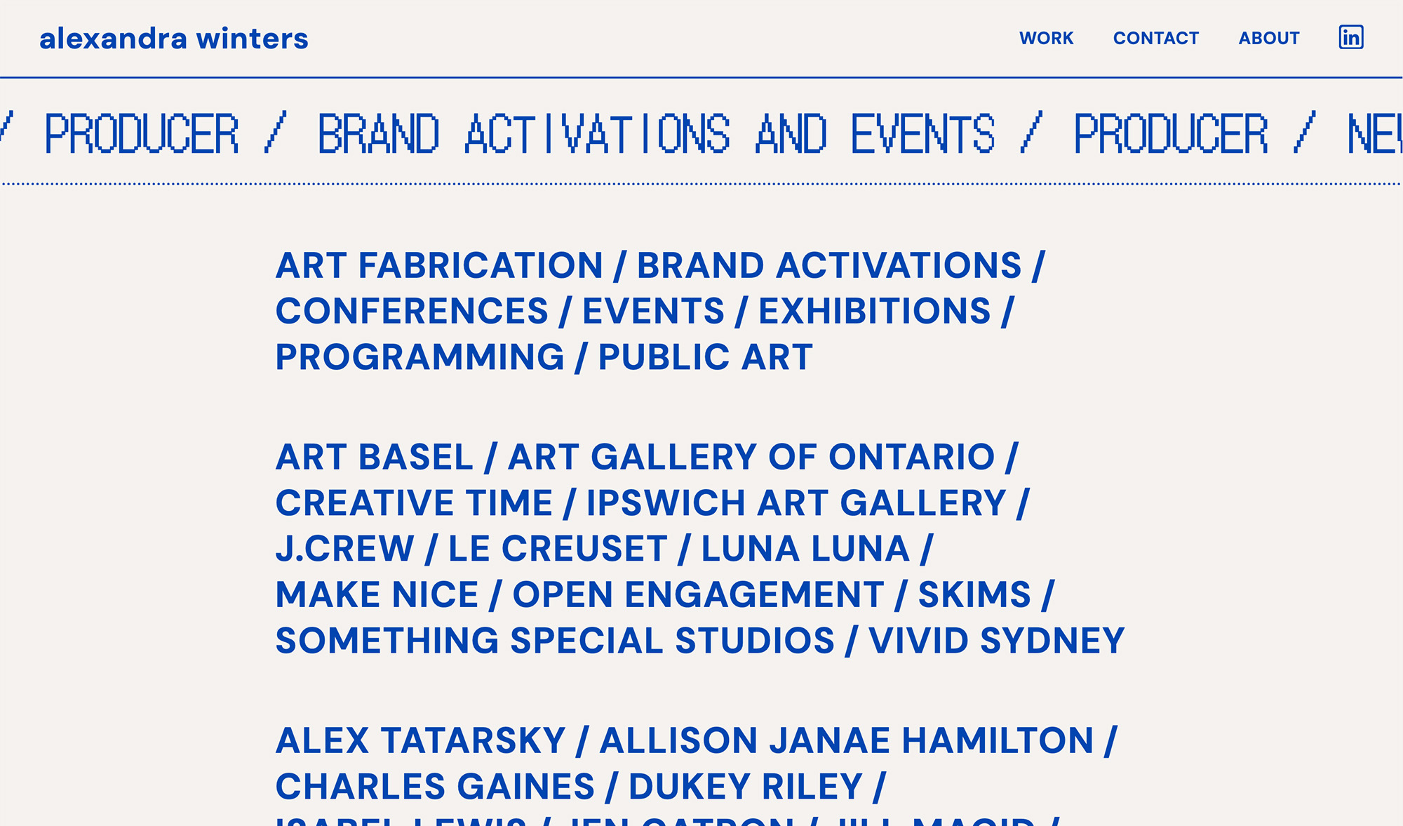
Alexandra Winters is a New York-based independent producer specializing in contemporary and public art, public programs, and conferences. She has produced new commissions and site-specific projects for organizations including Creative Time and Luna Luna, bringing work to cultural institutions and public spaces around the world. The website needed to reflect the ambition and range of her practice.
Brief
Alex needed a website that felt as considered as her work. Something with a distinctive visual identity that could flex across a wide range of projects, from public art commissions to international conferences. The goal was to keep the implementation lean and the design bold.
Approach
The site is powered by Astro and built with HTML and CSS inspired by Andy Bell’s modern CSS methodology, a utility-first, cascade-friendly approach that keeps the codebase simple and maintainable. This was a deliberate choice that keeps the site fast and the code easy to understand.
Project content is stored as structured JSON data, which drives the generation of pages and components. Add a new project to the JSON and the site builds it out automatically.
Marquee and splash screen
To add some personality to the site, I designed a vintage style Marquee component using a fun, even if a bit unbalanced, font that was built for use with Japanese characters but looks great in the latin characters as well.
The marquee is introduced on the splash screen but sticks around on the home page, same component but colors configured via custom properties to match the home page color scheme.
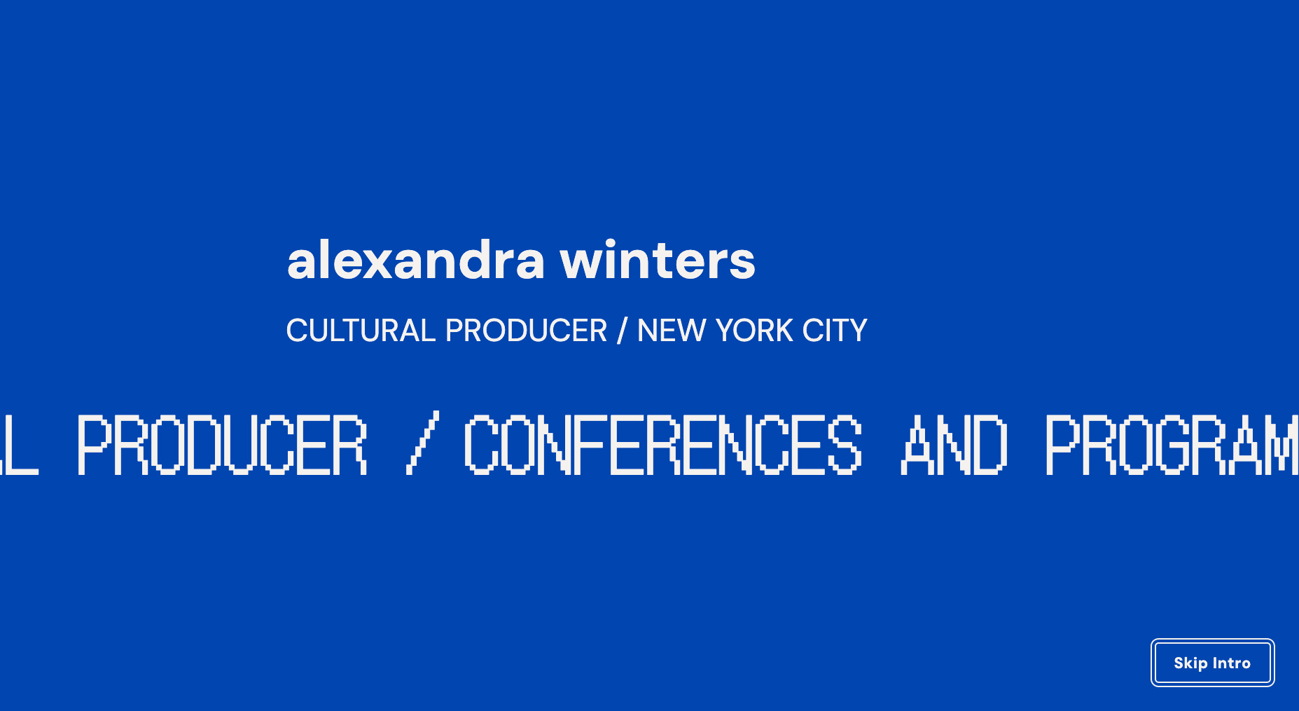
Although splash screens can sometimes be intrusive, the design makes the screen easy to skip but it also dismisses quickly enough that it doesn’t keep the visitor from the site content for long. The added “moment” the splash screen creates makes the site feel as though you are entering a special space. Visitors that use ‘prefers-reduced-motion’ will skip the splash screen automatically.
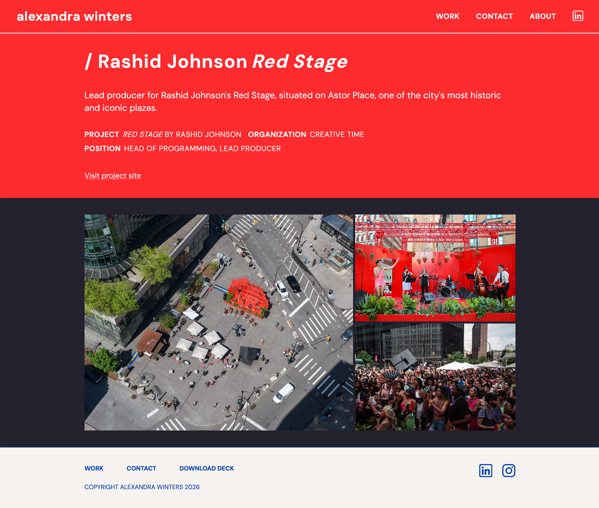
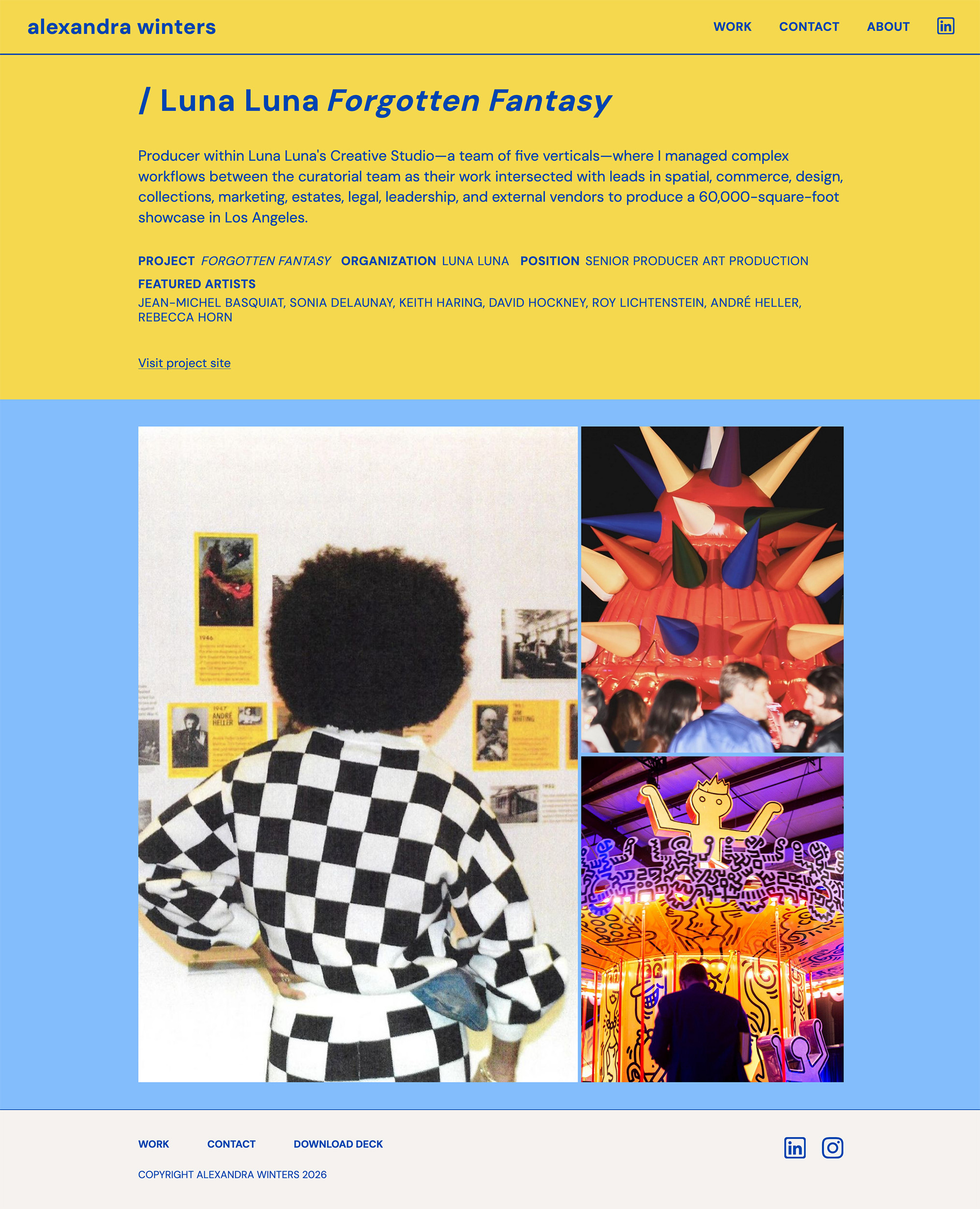
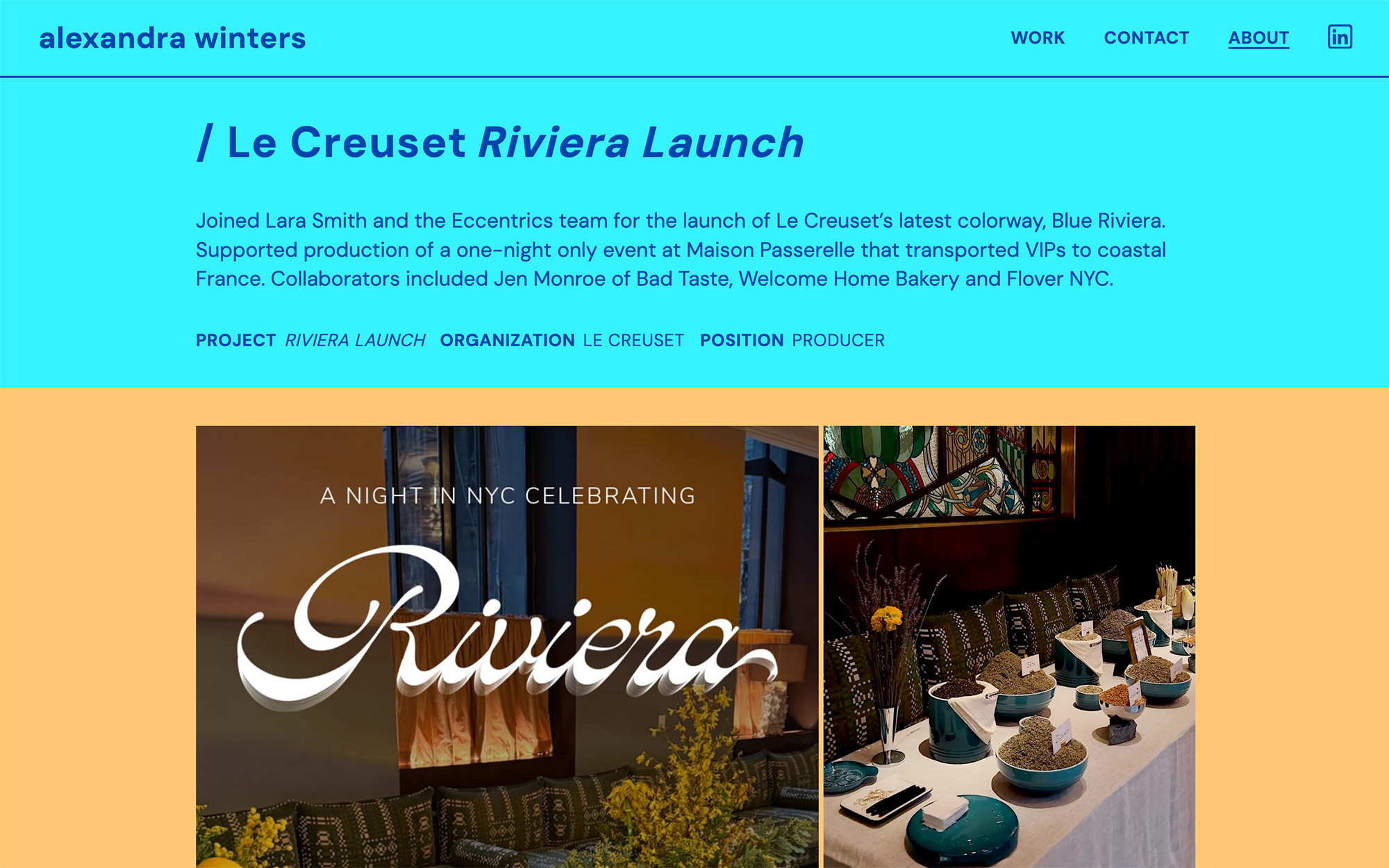
Themed project pages
One of the more distinctive features of the site is that each project page has its own color theme, pulled from the project’s data and applied via CSS custom properties.
Something Alex mentioned early on in the project is that her personal branding should’t compete with the work, as her and her collaborators bring the clients’ projects to life with the clients’ own branding. This gives every project a unique feel while keeping the layout consistent and the implementation simple.
User Research
To get feedback on the site in the build phase, I designed a lightweight study and selected participants for the interviews who were in similar roles to Alex’s clients and collaborators.
These interviews gleaned early insights into how the presentation of the work can influence visitors impressions on credibility, capabilities and how and what would drive them to the engagement phase for hiring.
Visual design
The visual design leans into bold typography and generous whitespace, with the themed project pages doing a lot of the expressive work. The home page marquee adds energy without competing with the work itself.