Branding & Graphic Design

Identity for Vicki Meintjes, Sweet Maker

Brand identity and packaging for a Sydney dessert maker, drawn from textures in her work.

Vicki Meintjes makes desserts, works of art that taste good, so the identity took its cues directly from them: the jagged, fractured lines and colors are drawn from her broken chocolate and cake textures.

I explored several concepts before landing on the version she chose, and extended it into business cards and stickers for her cake boxes. I also mocked up further packaging concepts to show how the system could grow, though those didn’t go into production. She later went on to appear on Zumbo’s Just Desserts.


A circular fractured brand mark for Vicki Meintjes Sweet Maker, split between soft pink, a thin yellow line, and a deeper pink section with jagged white crack lines running through it.

The mark Vicki chose, drawn from the look of broken chocolate and the glaze textures on her perfectly circular cakes.

An alternate brand mark concept in a bold, playful style, with a coral leaf shape, blue and yellow circles, and a pink jagged base inside a navy ring.

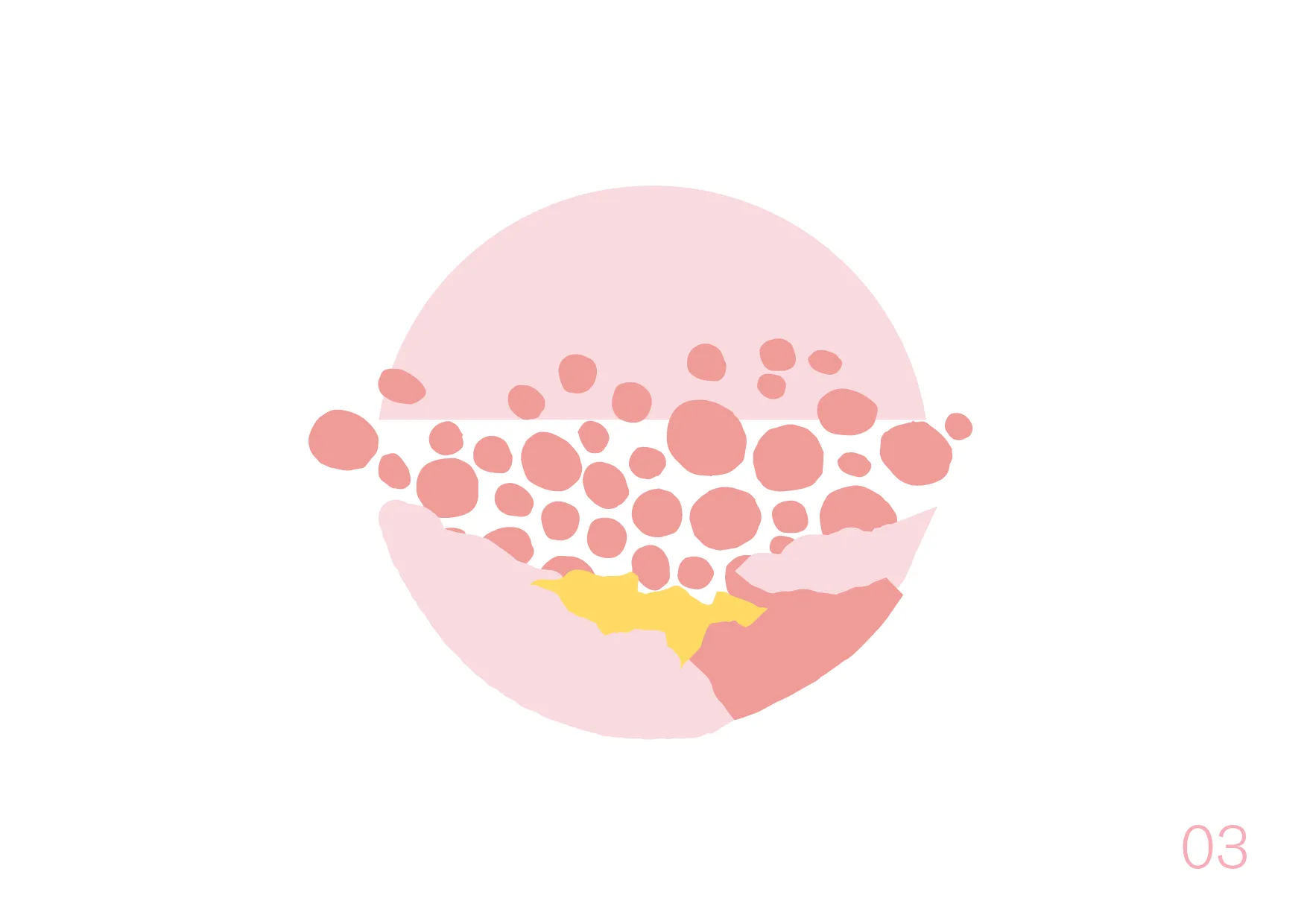
An alternate brand mark concept built from clustered pink dots forming a circle, with a pink and yellow jagged section at the base.

A couple of the alternate directions explored before landing on the fractured circle.

The Vicki Meintjes Sweet Maker logomark in charcoal grey, pairing a bold sans-serif wordmark with a script sweet maker line.

The chosen direction for the wordmark.

An alternate logomark concept in black, built around an oversized script capital V leading into the Vicki Meintjes wordmark.

A favorite alternate wordmark design.

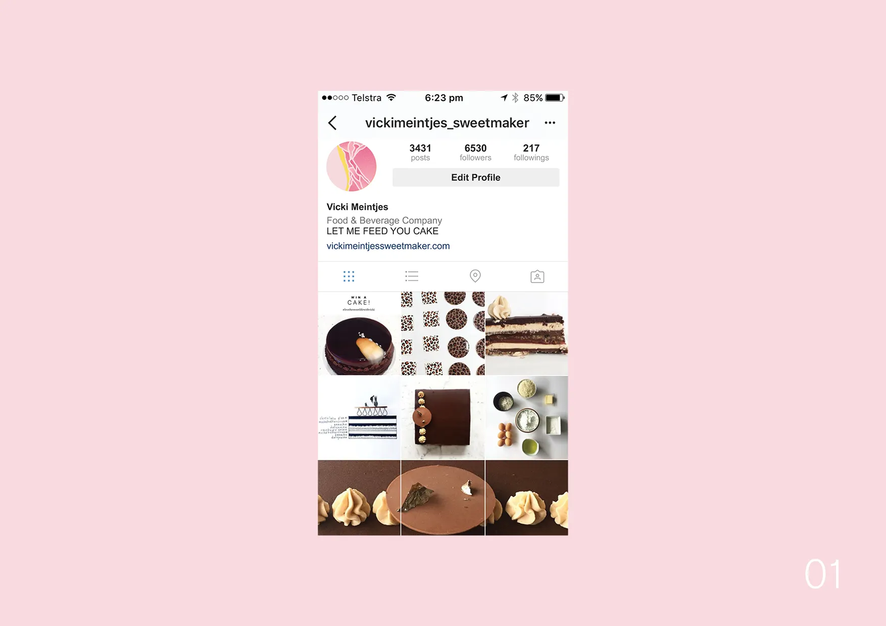
The Vicki Meintjes Sweet Maker Instagram profile, using the brand mark as the profile photo above a grid of cake photography.

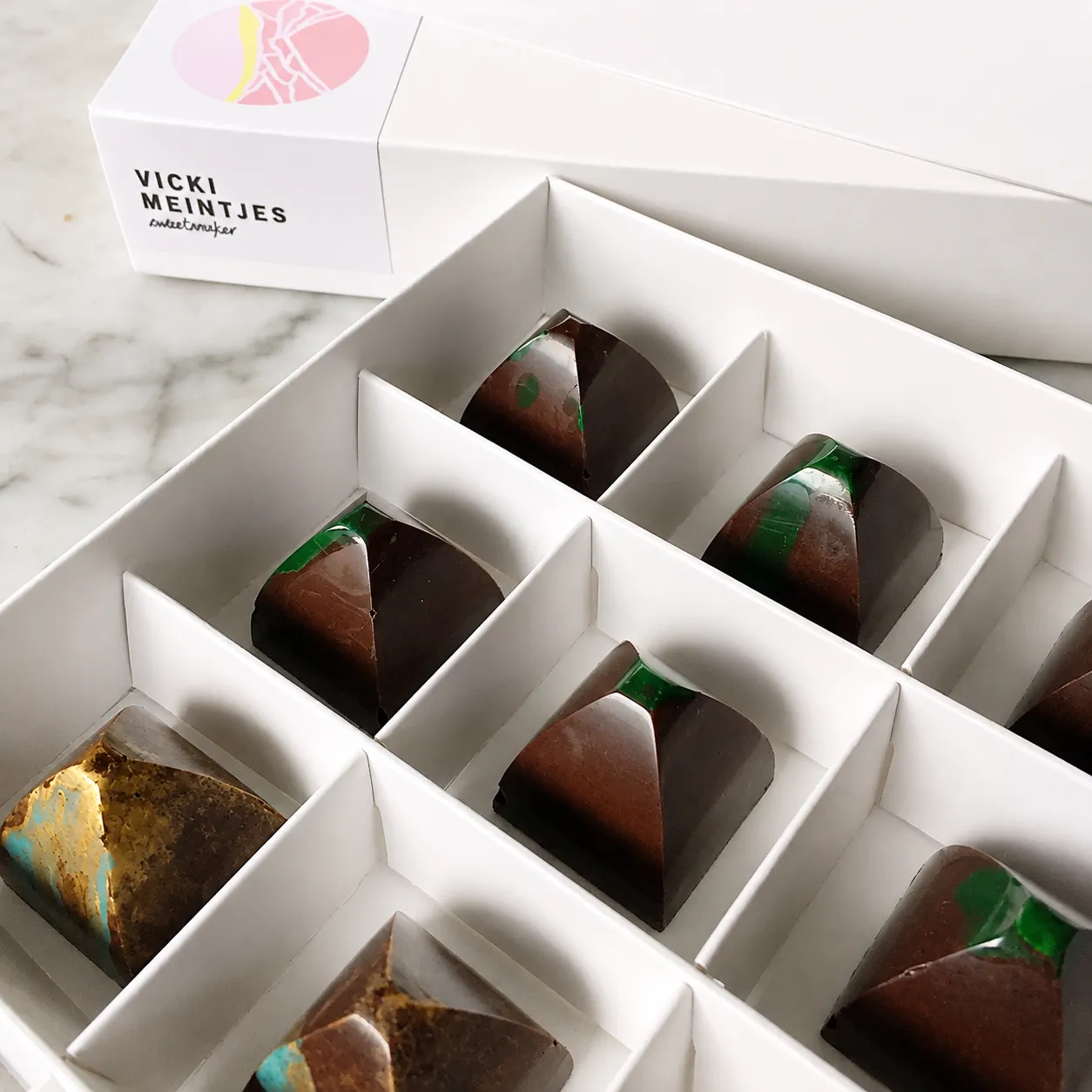
An open box of Vicki Meintjes chocolates with the fractured brand mark sticker and wordmark on the lid.

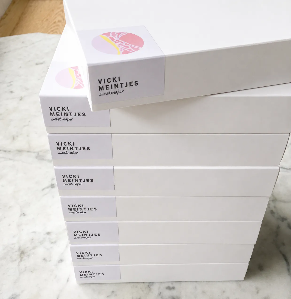
The brand mark applied as a sticker across her cake and chocolate boxes.

A stack of Vicki Meintjes Sweet Maker cake boxes, each finished with the brand mark sticker on the end panel.

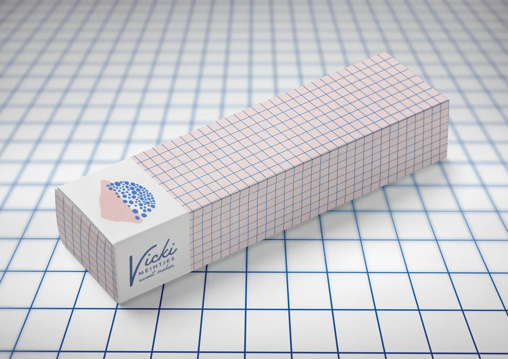
A packaging concept exploring a grid pattern in pink, paired with the dotted brand mark, for a longer box format.

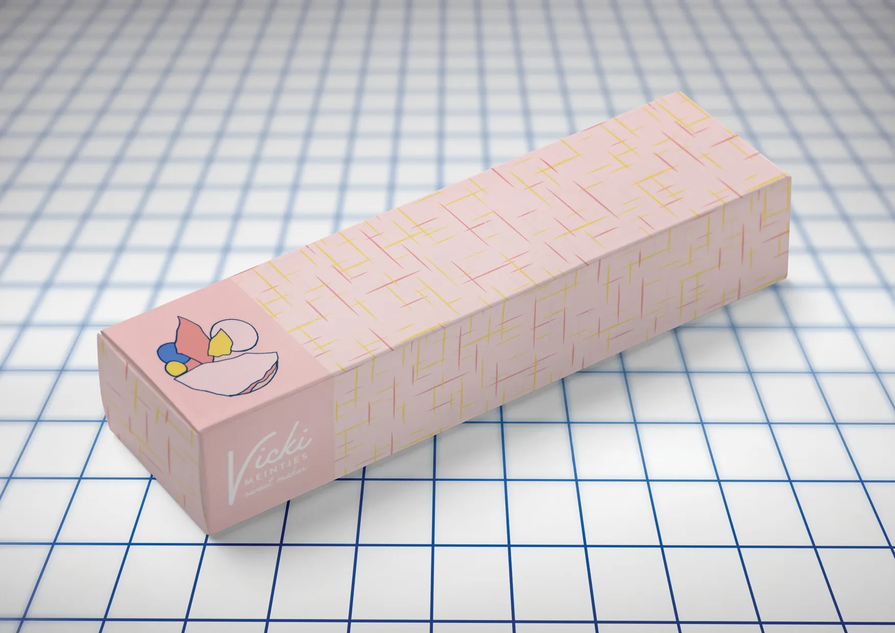
Further packaging concepts mocked up to show how the system could grow, though these didn't go into production.

A packaging concept with a vintage-inspired crosshatch pattern and the full-color brand mark illustration.