Branding & Graphic Design

Cosmetics Packaging for Napoleon Perdis

Applying a brand refresh across new and existing packaging.

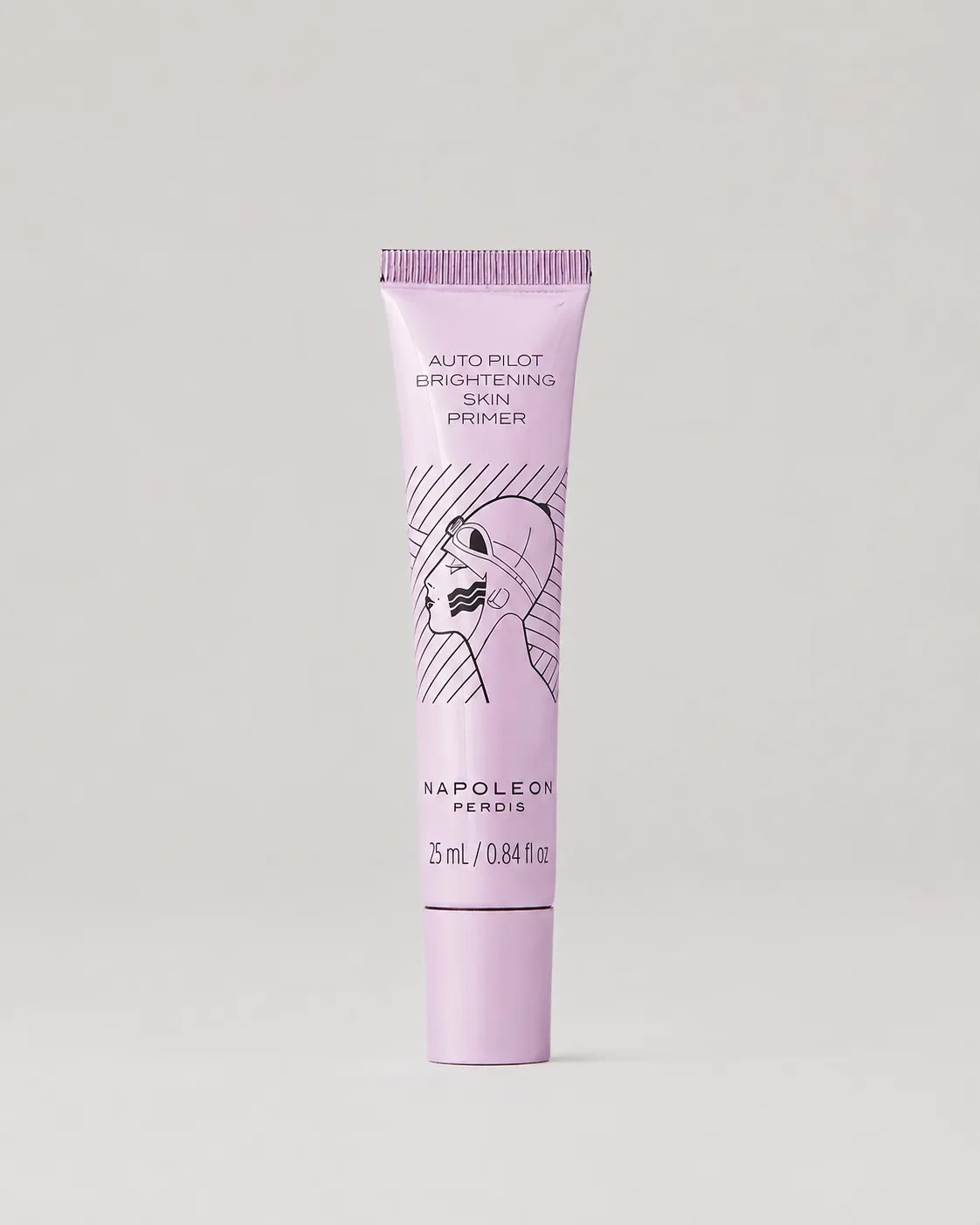
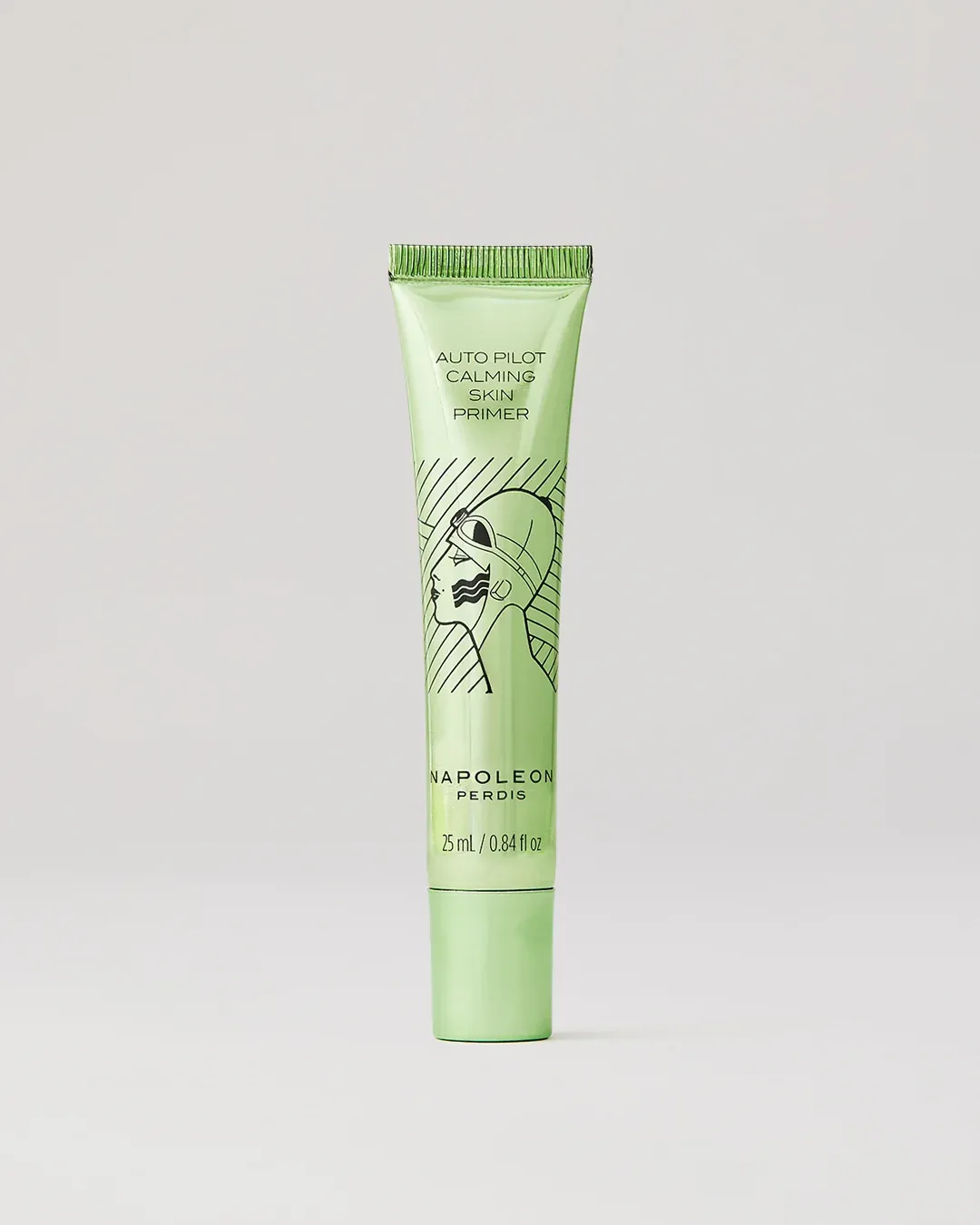
Napoleon Perdis had just gone through a brand refresh, new logo, updated identity, and needed it carried through their product line. I applied the new branding across three skin primers: an existing gold formula getting a redesign, and two new formulas (brightening and calming) built from scratch on the new system. Each one meant full print-ready artwork, ingredient panels, and press marks matched to spec.

The system held up well beyond these three: Napoleon Perdis later extended it across different packaging shapes and formats as the product line grew.
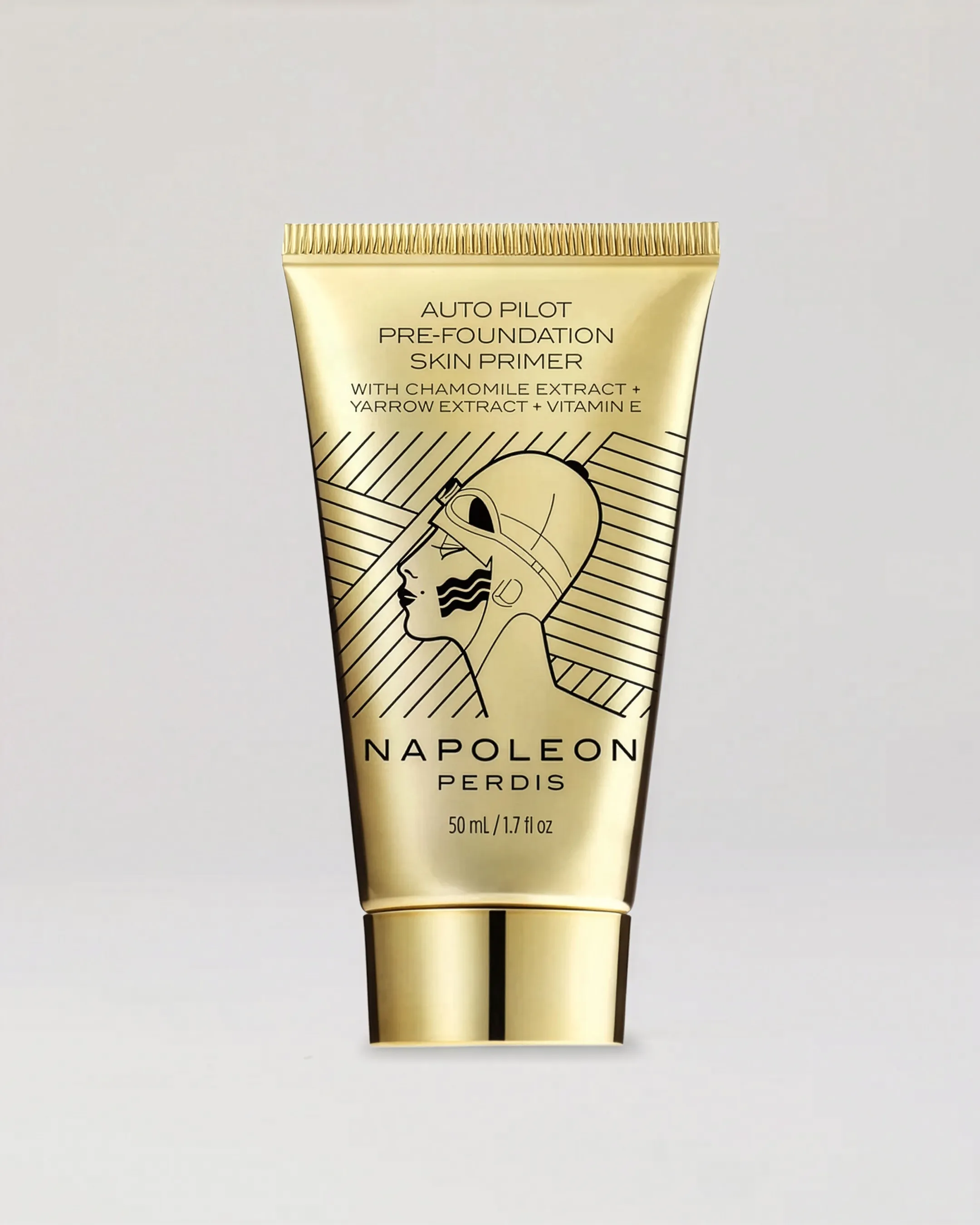
Napoleon Perdis Auto Pilot Pre-Foundation Skin Primer, old and new packaging side by side, showing the brand refresh from the original stacked logo to the new centered logo and illustration

The brand refresh involved a new logo and updating the layout of the classic illustration.

Napoleon Perdis Auto Pilot Calming Skin Primer in a green tube, part of the new primer line built on the refreshed brand system.

The new layout and logo was extended to the new products with a different shape.

Napoleon Perdis Auto Pilot Brightening Skin Primer in a pink tube, part of the new primer line built on the refreshed brand system.