Design Systems

Design System at Learnosity

Building a design system from scratch, and using it to align a powerful set of products.

Thumbnail of the Learnosity design systems first foundation library

During my time as a Senior Product Designer at Learnosity, I led the effort to build the company’s first design system from scratch, then used it as a foundation to align the five products in the Learnosity ecosystem, starting with color and icons.

There was no shared standard for color, spacing, or components when I joined, just years of accumulated inconsistency and a lot of Slack back-and-forth over small decisions. I built the business case, ran the research, and led the project from idea to production.
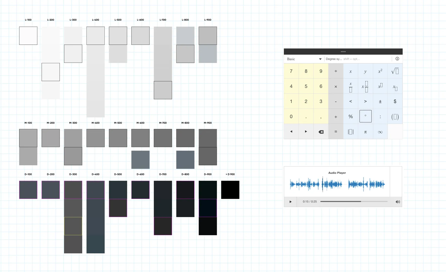
Color audit of the Learnosity products showning the greys audited and a calculator and audio player using those colors

The initial color auditing uncovered 375 colors used across 5 products, many indistinguishable.

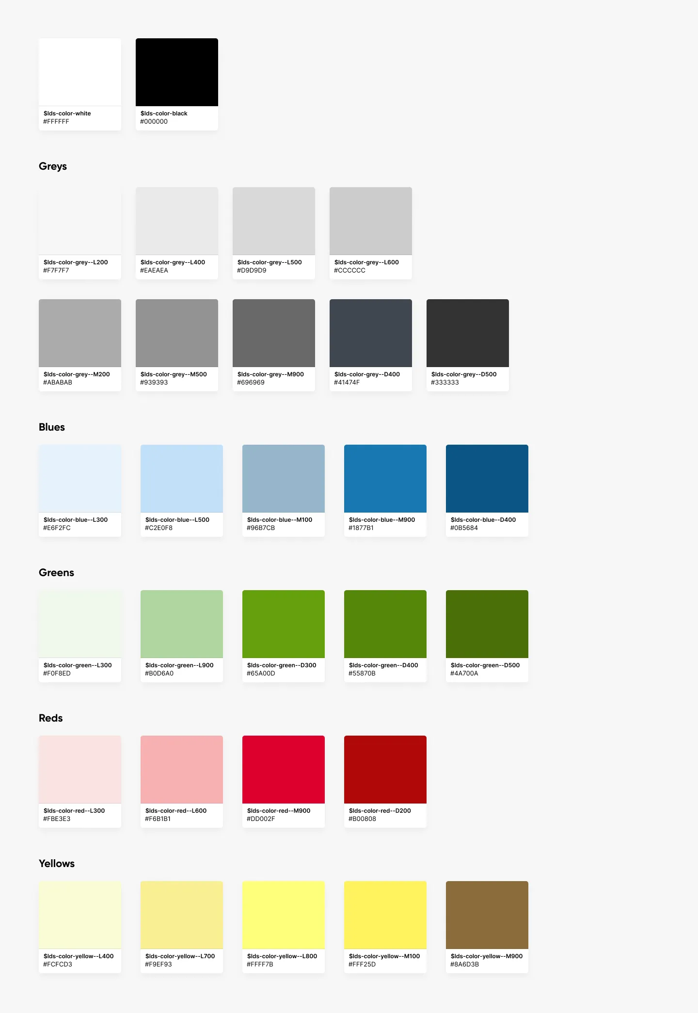
First version of the Learnosity design system color palette of 30 colors

Version one of the Learnosity, all white-labelled products, design system color palette of 30 colors.
I built the business case and led the research to get Learnosity’s design system off the ground, cutting the color palette from 375 colors down to 30.

Read about starting a design system
I created a system for designing icons and used it to bring the 39 existing custom icons into a cohesive set.

Read about the icon refinement