Visual Design Showcase


A showcase of some of my favorite visual design work


Skills / Tools

  • Visual Design
  • Writing
  • Layout
  • Typography
  • Adobe Illustrator, Photoshop, InDesign

Formats

  • Print – Marketing
  • Print – Book Design
  • Print – Forms and brochures
  • Print – Large Format, Packaging
  • Brand Design
  • Apparel Design

Design comes in many forms and can add a moment of beauty in someones life, make doing the necessities easier, or be worn and used among many things. I have had the pleasure of working on different design projects in my experience that touch a few of these areas. Here are a few of my favorites.

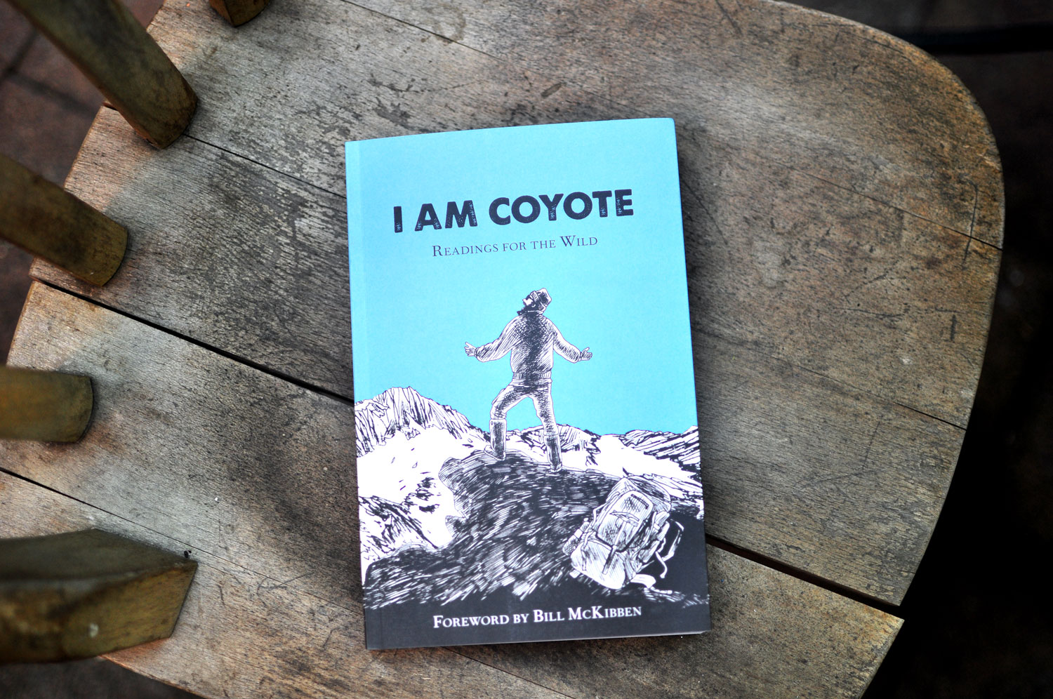
I AM COYOTE: Readings for the Wild

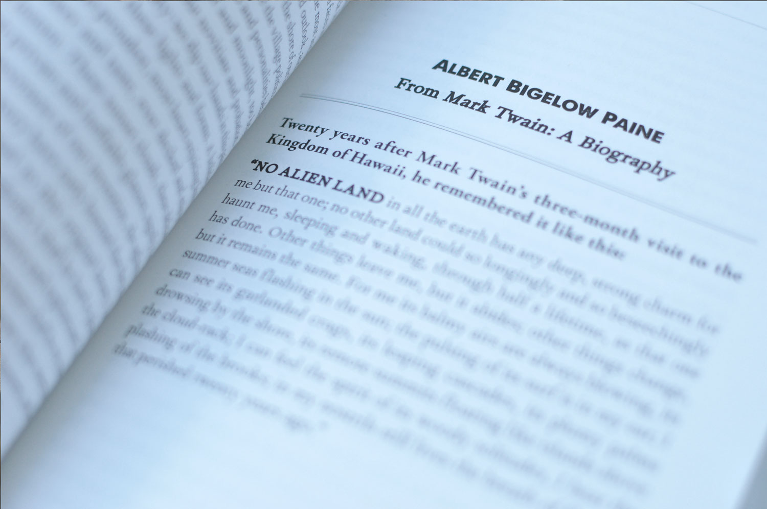
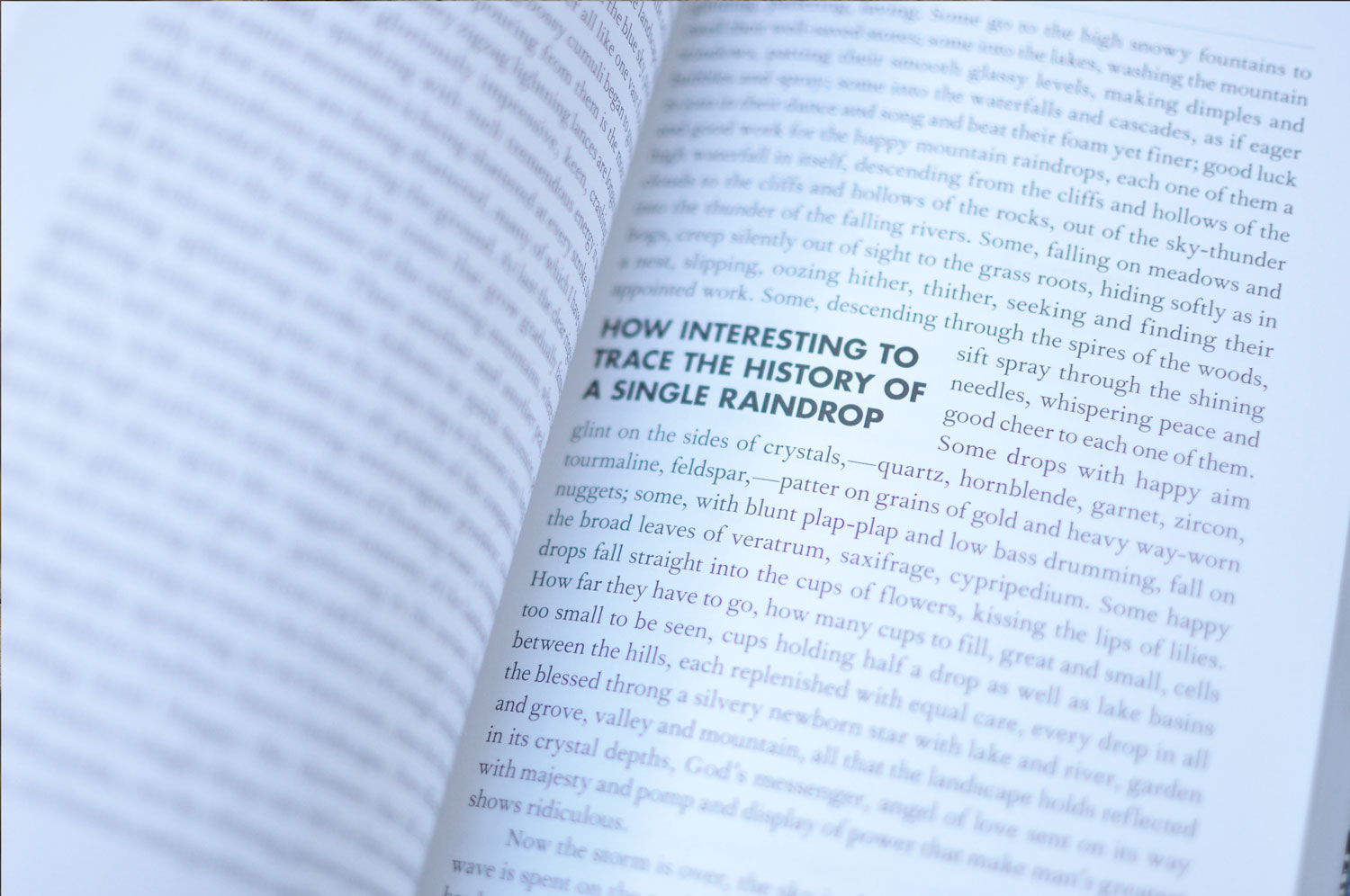
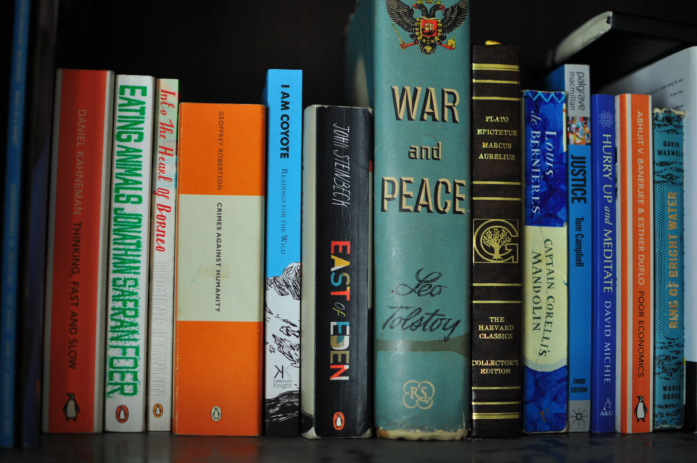
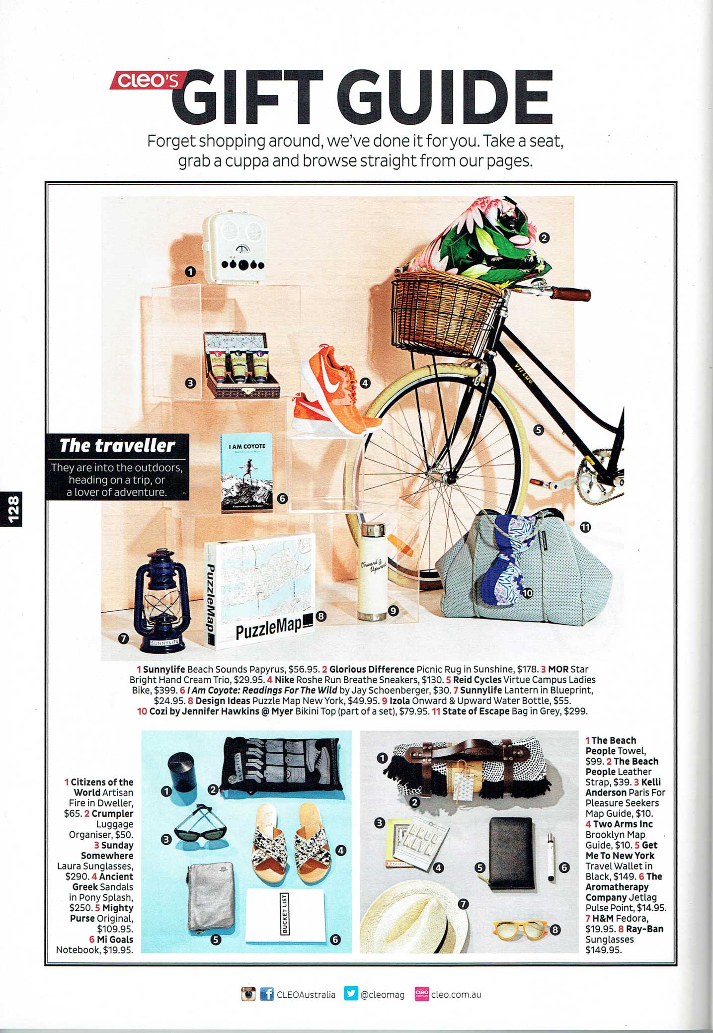
Cover of the I AM COYOTE: Readings for the Wild book with an illustration of a man on top of a mountain yelling out. Inside image of a section title page in the book. Inside image of a page with a pull quote in the book. Book sitting in a book shelf with other classics like War and Peace and East of Eden The book was featured in the CLEO magazine gift guide.

A selection of images of the finished product book I AM COYOTE: Readings for the Wild. Available at www.readingsforthewild.com

This project was a really exciting one as it was my first large scale book project. I had worked on smaller image books and many, many large catalogs before but this project gave me the creative reigns to put my typography skills and proofing eye to the test.

My client put a lot of careful consideration into to each and every excerpt that was included in this anthology and I wanted to make sure the choices I made around typefaces, typesetting, and layout design made the experience of reading this book around a campfire as delightful as possible. I learned about systematic styling in typesetting referencing heavily the Chicago Manual of Style. I also learned about different printing techniques and enhancements like the french fold book cover and line length best practices for reading.

Vicki Meintjes: The Sweetmaker

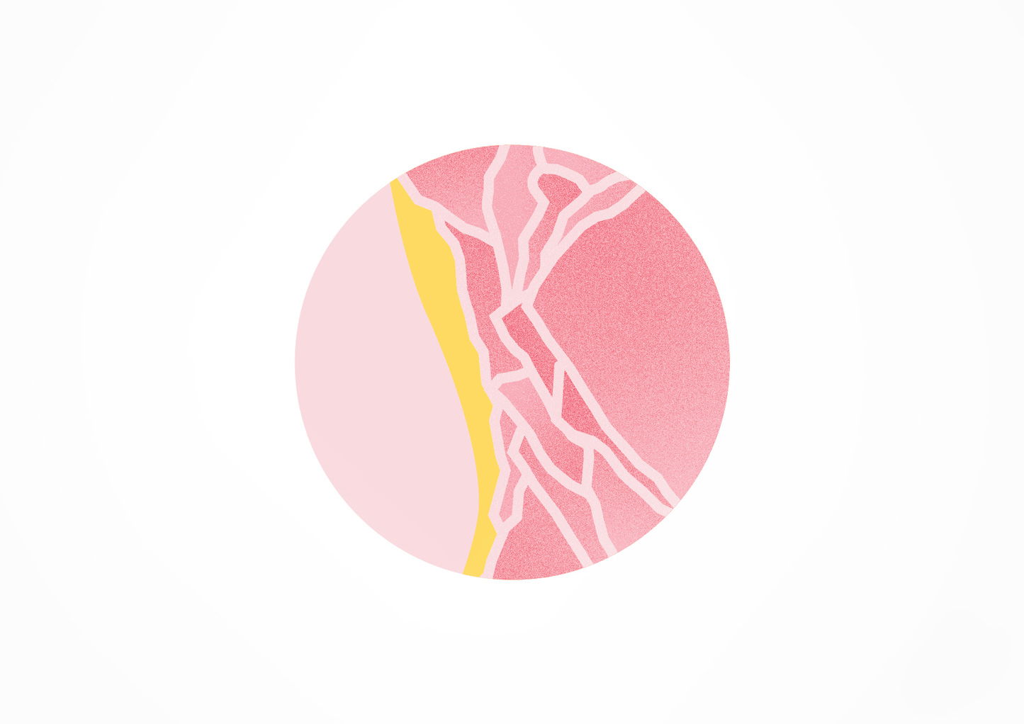
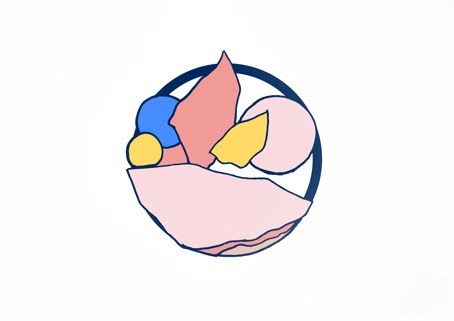
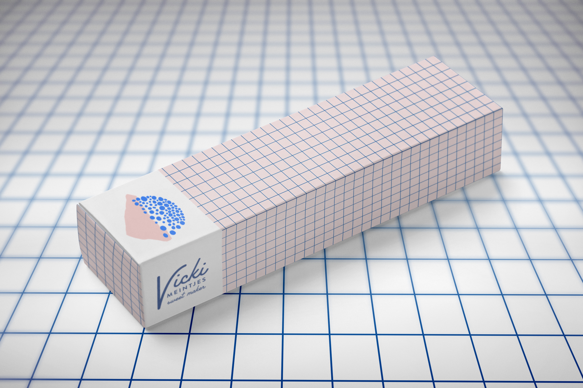
Brandmark shape that is pink and yellow with shapes inside it based on honey-comb pieces Another version of the brandmark shape but with bolder colors including navy and bright blue with the pink and yellow. Variations of the brandmark shape. A concept of the wordmark for Vick Meintjes Sweetmaker in bold typography. An alternate concept of the wordmark for Vick Meintjes Sweetmaker in a retro style, curvy typography. Packaging concept with grid pattern. Packaging concept with mid-century modern pattern.

Some of the concepts and proposals from the branding project for Vicki Meintjes: The sweetmaker. You can see her beautiful cake and dessert work here on Instagram.

A fun branding project for Vicki Meintjes: The sweetmaker. Vicki makes beautiful cakes and desserts and wanted her brandmark and typography to reflect them well.

The favorite brand mark shape was based off broken honeycomb she uses to style the desserts.

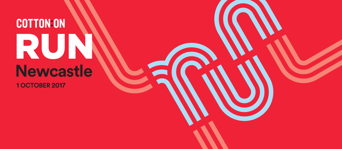
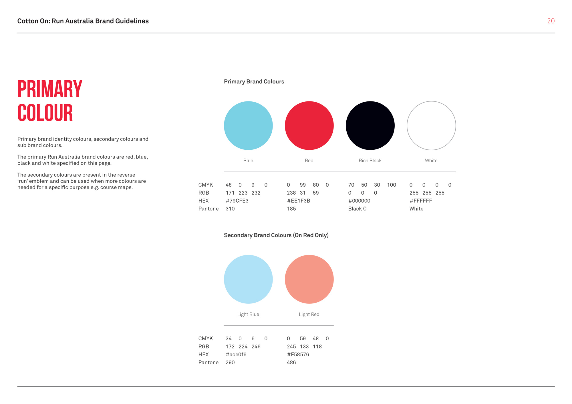
Brandmark for Cotton On's Run Australia, a fun run in 4 cities across Australia. Fun run route map for Cotton On's Run Australia, a fun run in 4 cities across Australia. Color brand guidelines for Cotton On's Run Australia. Poster layout brand guidelines for Cotton On's Run Australia. Kids cape screen print design for Cotton On's Run Australia.

Selection of graphics for Cotton On's Run Australia event branding and collateral.

In 2016, I was brought on board as a contractor to work on Cotton On's Run Australia event branding and collateral. The style of the RUN brandmark was inspired by the branding for the 1968 olympics in Mexico.

For this project I needed to design, create brand guidleines and manage over 100 individual assets for social media, printed merchandise, large format banners and signage, wayfinding, and the course maps for runners to follow on the day.

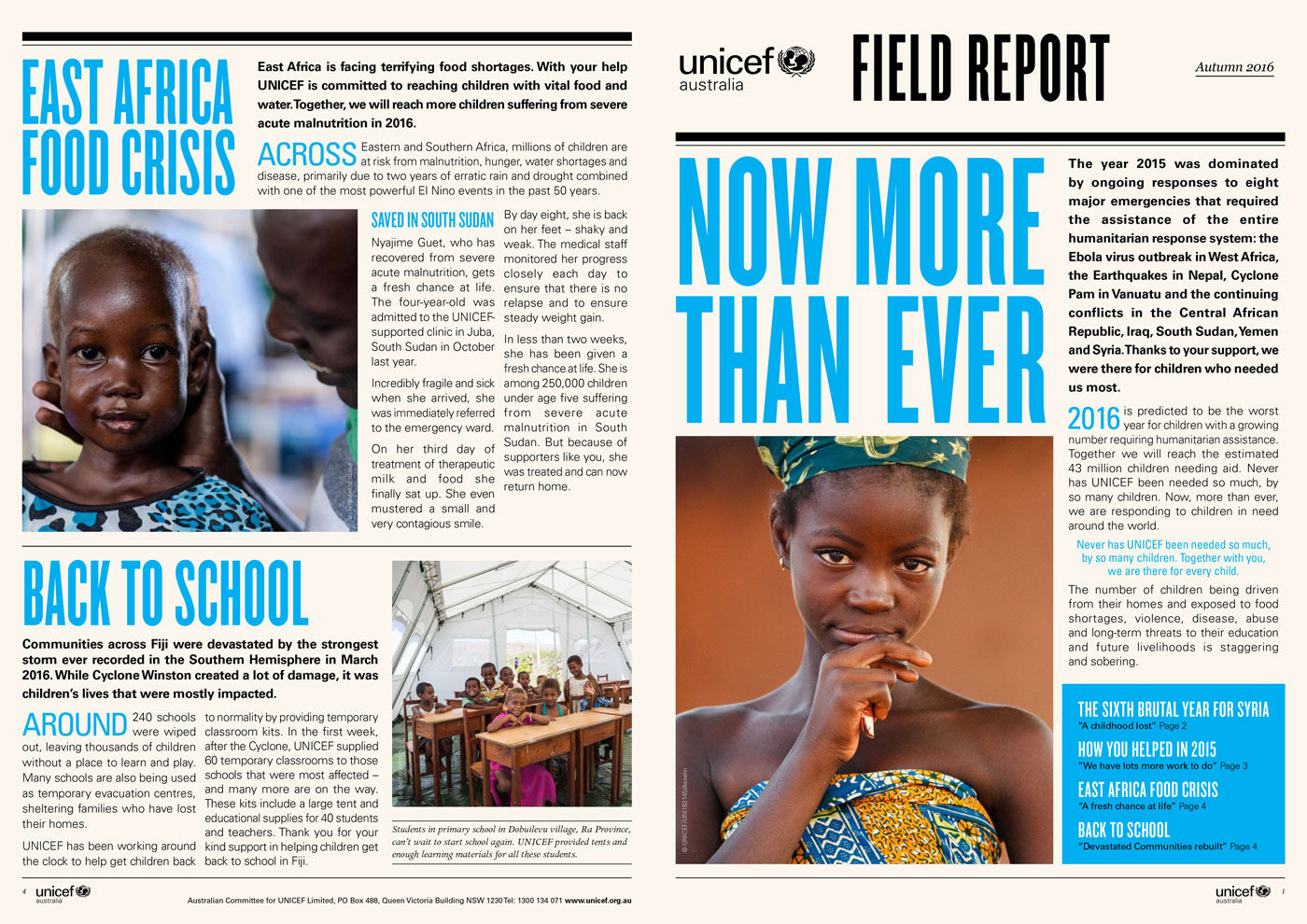
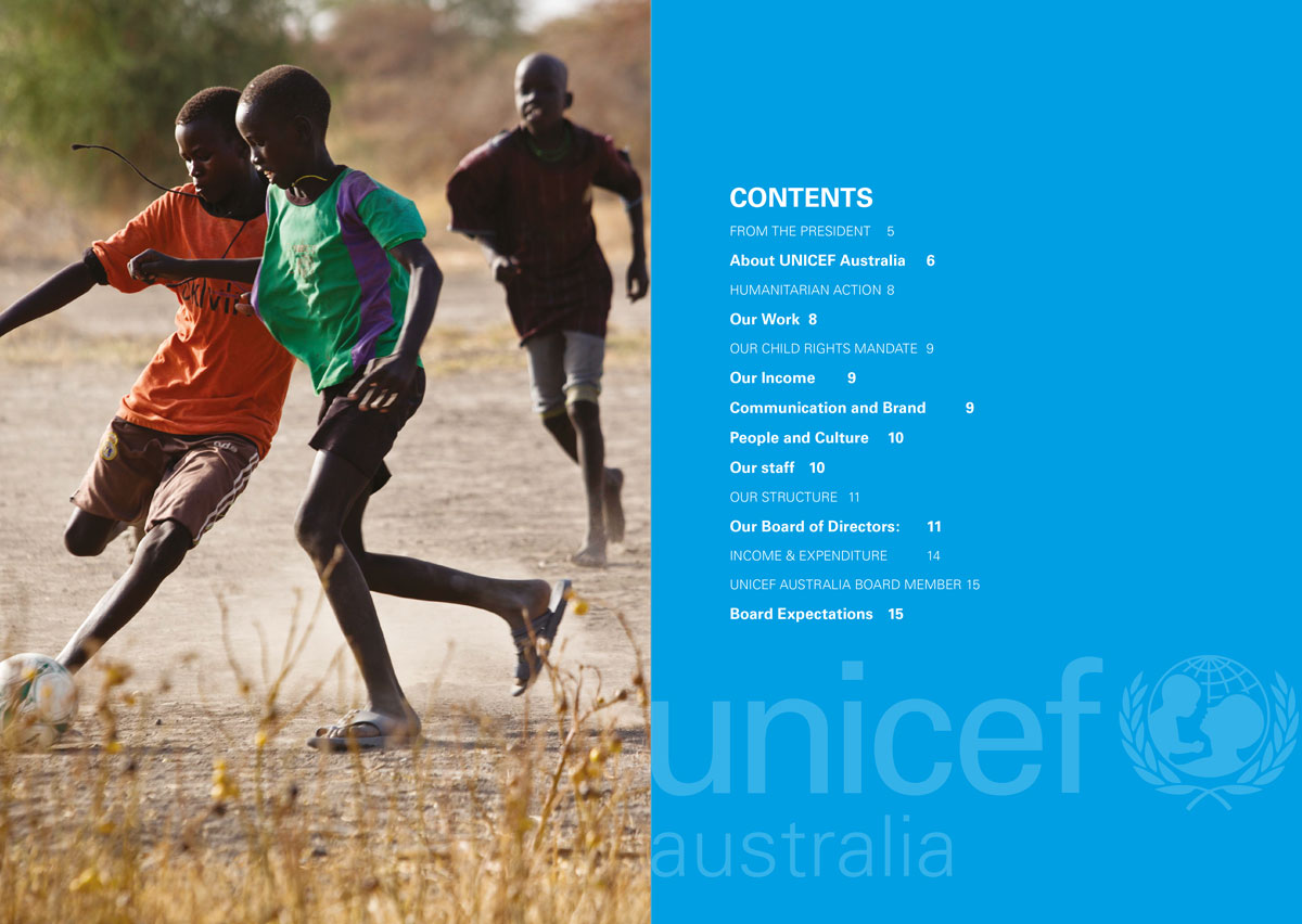
Image of a regularly published UNICEF publication called the Field Report. Image of the table of contents for the UNICEF Australia annual report. Image of a square roll fold brochure for UNICEF Australia. This was to raise donations for issues stemming from a large drought in Eastern and Southern Africa in 2017.

A selection of work done for March One agency who mainly work for not-for-profits helping with fundraising collateral.

I had the opportunity to work as a designer for the creative agency March One. The clientele were mostly not-for-profit organizations with a focus on fundraising campaigns delivered digitally and in print.

Many of these projects required the design to tell a story and all of the artifacts needed to be consistent and powerful to help get a key message across. Working directly with the creative director, we were able to come up with creative ideas one of my favorites being a square roll fold brochure (seen above) where the story changes with each opening.

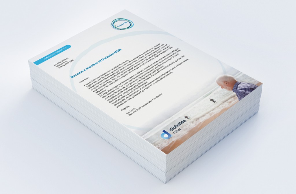
Image of the front of a Diabetes NSW membership form with a letter. Image of the back of a Diabetes NSW membership form with form fields. Image of DL brochure style Diabetes NSW membership form.

Updated printed membership forms for Diabetes NSW.

I was able to work on many interesting projects during my time at Diabetes NSW but one of my favorites was the project to update the membership forms that people living with diabetes who want to become a member need to fill out snd return to start their membership.

The reason I really liked this project was that the quality of the design of these forms impacted not only the person signing up for membership but also the data entry staff who would need to process these forms. I was able to observe the issues that they were having with the data when prospective members had to work really hard to fit their information into the form often making it illegible.

By observing the different users of the forms and testing out my design, I was able to create a usable print form that saved time for the person filling it out as well as the person processing it.