Learnosity is a white-labelled, set of embeddable API’s that cover the authoring, delivering, capturing and reporting on student responses for online assessments. With 14.8M monthly users, powering the world's leading learning platforms and publishers.
The Brief
One of the most popular Learnosity question types is the essay question with rich formatting, like bullets and text formatting, as it is useful for educators to assess a students ability to explain their responses and thinking. Handwritten drawings and diagrams can be used for clearer explanations to accompany a students digital response.The existing question type did not have a way that students could incorporate images within their essay responses so the product team was tasked with coming up with a solution that met the students needs as well as a grader evaluating the students work.
My Role – UX design and research
For this project I was the lead designer and was responsible for:
- Discovery research including interviews with students, clients, and domain experts
- Design exploration and wireframing
- Prototyping
- User flows
Working collaboratively with the team we were able to develop a shared understanding of the problem, identify our user needs and context, and deliver a feature that met those needs and in turn was successfully adopted by multiple clients and met our defined success metrics.
Discovery Research
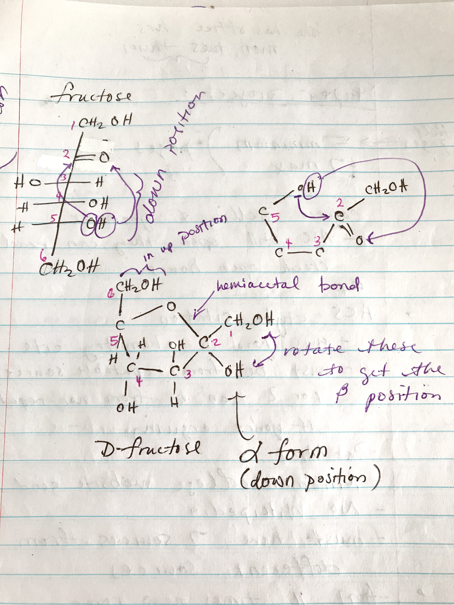
Discovery research uncovered more information around the users needs and context which helped my understanding of the importance of certain capabilities in the user flows of both students and teachers. This diagram is a real example of an image a student might include in their essay response.
Before starting on any design exploration I did some discovery research to help me understand the problem and the user personas, including what they are trying to achieve and where and how are they doing it. The research included desktop research, interviews with two students about their experiences, leveraging existing research available from a domain expert in teaching and grading online assessments, and sessions with our clients to understand their specific users needs.
Through my research I also wanted to understand our current capabilities, if there were any existing UX patterns in our products that we should leverage, and what were the best practice UX patterns existing today. It was important to me to not maintain existing patterns if they are not
Design Exploration
The design process for me always starts with a lot of questions and more questions arise as you go. From what we learned about our users needs we could answer some questions but still needed to ask others.
- How does the student want the image to look?
- What devices will the student use to take their image?
- How will they get their image to their computer? Is it already there?
- Will their be issues with image size?
- How can we help the student feel confidence in their upload?
- How does stress impact a student when uploading images for a test?
- How can they resolve mistakes? e.g. uploaded the wrong image, image orientation, image name
- For graders, what is important for them to see in the image? What other content might they have on their screen when grading?
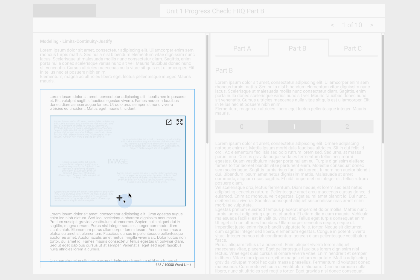
The design process included basic clickable prototypes to run through with users and clients for the different views. These prototypes also aided conversations and prioritization of the different capabilities available in each users view.
Understanding the Whole Interaction Flows
Getting deeper into the design it was helpful to put together detailed user flows that broke down the interaction. By doing this I was able to identify all of the points where a student or grader might experience an issue or where we could simplify or "add delight" in the process. I was also able to break down the different mental models the user might have and compare them to what's technically happening in the background.
An example of where this helped me make a design decision was when we were considering image optimization. The initial designs included a warning that told the user when an image was optimized. When exploring this a bit further and doing some testing on different size images, I realized that high quality images from a variety of mobile devices had no visible change in quality when optimized. By showing a warning message for these images we eroded the confidence the student had in their upload. I made the design decision to make the warning show only when the image is just over the size of high quality mobile device images, therefore still giving the warning where it might be necessary but not for most students where there was no image quality change.
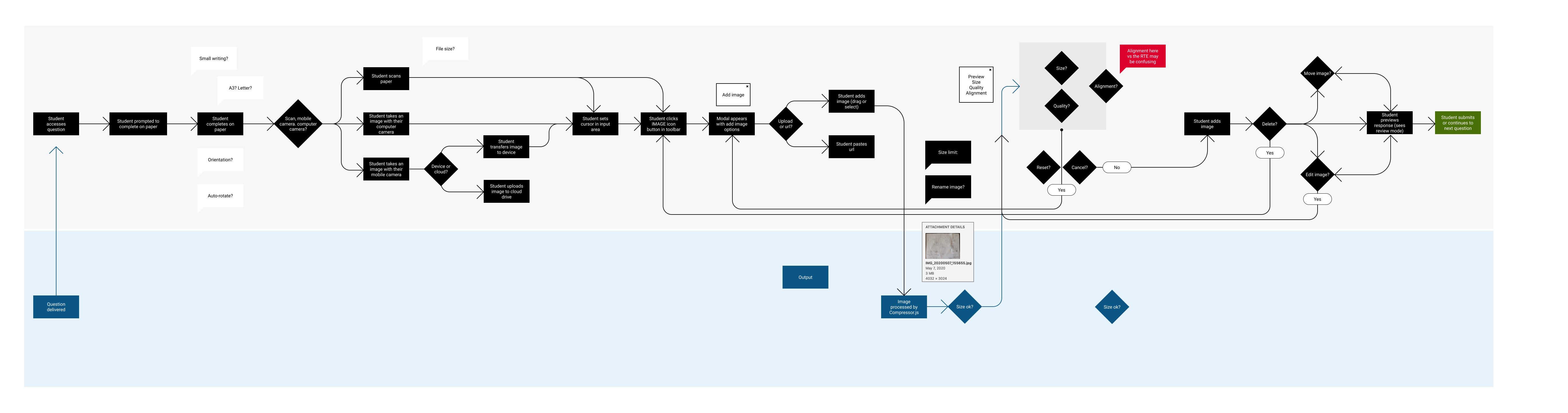
This user flow diagram of a student creating, uploading and submitting an image online helped to understand the process and mental models of the different users.
Learnings and reflections
The final deliverable included some helpful features for the student and grader personas that at one point were on the chopping block but were saved because of what the research told us. Note: The UI design had to use existing UI styles so is not very flashy
In this project I was able to use my research to impact the decisions the product team made when defining the "shoulds" and "musts" for this feature. By using the real world examples and user journeys to build a picture of the "why", my design decisions could bring the personas and their context into the product development process.
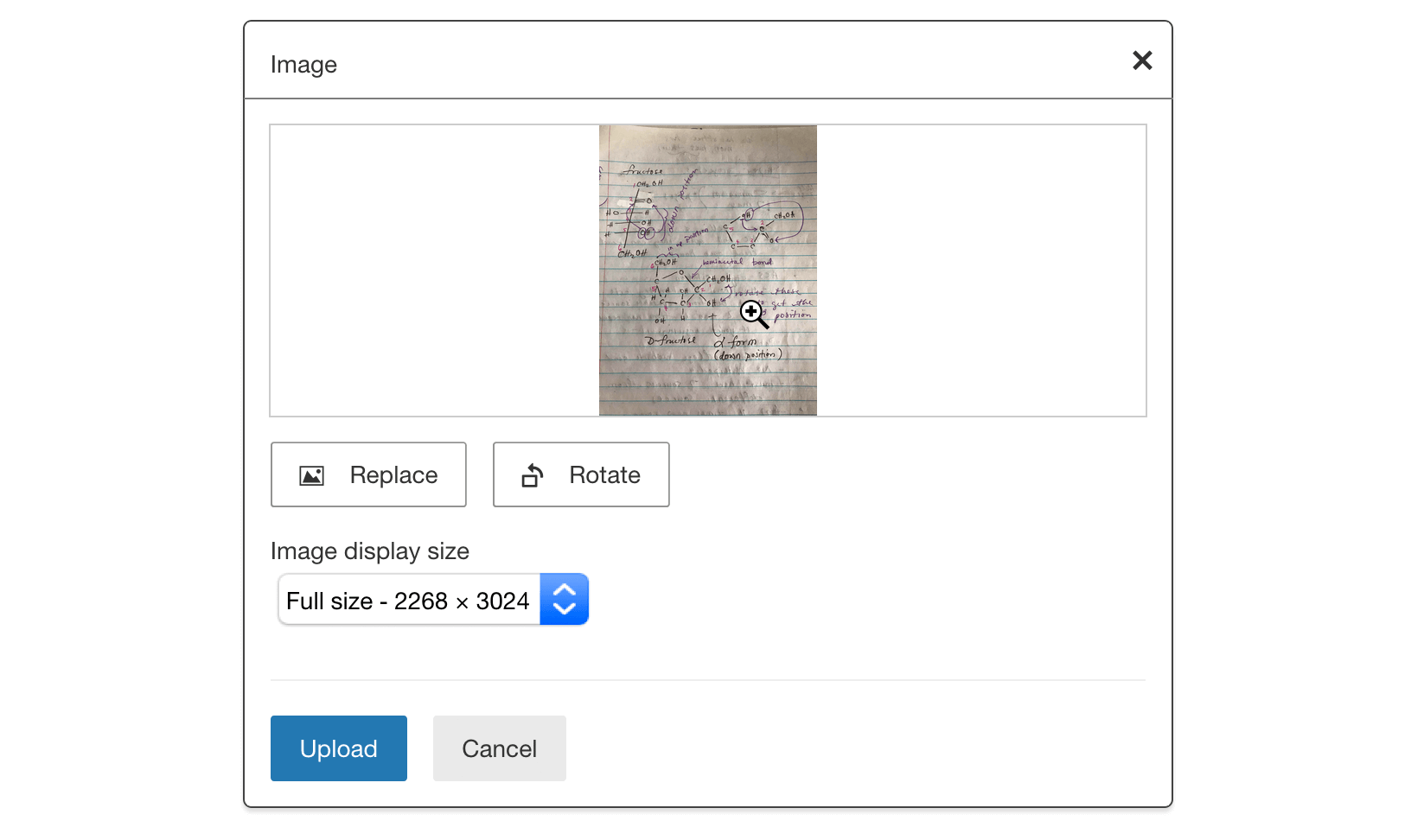
The power of getting across the emotional situations of our users, for example a student in a stressful situation during a test or a time-poor grader trying to assess their students effectively, was what helped some crucial, even though small features, be included. Things like rotating or replacing an image for students and zooming into a specific location on an image can save our users time and stress when completing their tasks.