Learnosity is a white-labelled, set of embeddable API’s that cover the authoring, delivering, capturing and reporting on student responses for online assessments. With 14.8M monthly users, powering the world's leading learning platforms and publishers.
The Brief
For more than ten years, Learnosity had been operating as a development led organization. As expected, over this time, the codebase had a lot of legacy code and inconsistencies emerged within the product interfaces and interactions. The result of this had a measurable impact on the product development workflow.
Our initial audits highlighted a range of business challenges. Primarily we noticed an impact on efficiency which led to a lower quality experience for our users. We also needed to address the frustrations arising for designers and engineers who were working on the product.
Over two years, along with other existing priorities, the project went from an idea, then a concerted effort to get buy-in to having the core foundations and components being used in production.
My Role
My role as the lead designer for this project included:
- Gathering the research
- Building a business case including proposed phases with tasks and a timeline
- Fostering motivation for the duration of the project (glue work)
- Jumping into Figma to work on the component designs
Throughout the project I was also able to help other designers and developers contribute to the system.
Developing a business case for a design system
When I started at Learnosity, the first thing I did when I landed was try and get a lay of the land. How should I set up my design files? Is there a naming convention? Are there component standards I should follow? What is the product color palette? What are the processes for delivering my work and collaborating with development?
I soon found out a lot of these processes and guidelines were yet to be created. Over time, I noticed the little inefficiencies that missing these crucial pieces of information caused. Long back and forths on slack about what blue a button should be, working on a modal and not knowing what the pattern for the primary and secondary button placement should be in the product (as there was none), designers trying to rely on what exists and engineers having to create new components for very similar designs.
As a designer, it was easy to see that these decisions were all related and if our team wanted to focus on the hard problems, and not the ambiguity around patterns in the product, we needed to make, document, and share these design decisions. The way to solve this problem was by having some form of design system.
There had been a few false starts at getting some sort of style library created and I knew if I was going to get the buy-in from leadership I needed to be able to communicate why this should be prioritized enough to get on the road map, and in that process gauge the interest and excitement of the wider organization, especially the product people and engineers. The next stage began with just going out and talking to people.
The Approach
In order for internal stakeholders to make a business decision to put resources towards a design system, I needed to really understand the problem and build a business case that gave them the information they needed and clarified what we were actually proposing.
It was key to understand what problems the system would be solving and to identify the internal stakeholders who would need to support the initiative. I designed a discussion guide to capture their knowledge around design systems, their expectation of the benefits, and what they see as the risks and challenges. I also wanted to fully understand their definition of what success looked like.
The patterns emerging from the interviews helped me determine the ideal way to present the system business case back to them.
The next research stage explored the users of the design system. The main users were designers and developers, but the support team and product managers played an important role too.
A short, company-wide survey was created and sent out initially to gauge interest. After that a more in-depth developer survey was sent to interested developers where they could share their knowledge or questions around design systems, what issues they were having, and what would help them in their day-to-day work.
From the long survey there were clear patterns in the frustrations developers faced. The perceived benefits that emerged added strength to the case I was building.
The small, collaborative workshops with representatives from each team helped develop a shared understanding of what the design system could be and discover what the users of the design system felt was most important.
Lastly, I organized short, collaborative workshops (customized version of Product, Parts, People by Nathan Curtis), with a representative from each user group including product managers, support staff, and even some remote participants!
The workshops gathered people who rarely worked together and created space for questions and conversations that could be compiled into a project outline.
The insights gained were presented to key stakeholders and received great feedback – engaging more colleagues than expected who had heard about the proposal. With an energized product managers support, the design system project was formalized and included in a product teams road map.
Starting from the foundations
For the business case I wanted to be able to reuse the work and build a better case by showing the stakeholders examples of our current state. For this work we were able to audit the product colors and a few components, including buttons, into an Airtable repository.
From left to right you can see each round of grey colors we were able to "merge", we started with over 50 greys and by the third round of merging had just 9. Merging down the colors helped us understand where we use specific colors and why.
The color audit showed us the extent at which we were declaring color variables in the code bases for colors that were visually indistinct and we were able to merge these down and at the same time improve our color contrast for accessibility. We were successfully able to merge the colors across the codebases from 375 colors down to a core palette of 30 colors with clear uses for each.
After the colors we focussed on auditing and defining our core foundations, typography, icons, and spacing, always learning a bit more about how and why we used each foundation in the products.
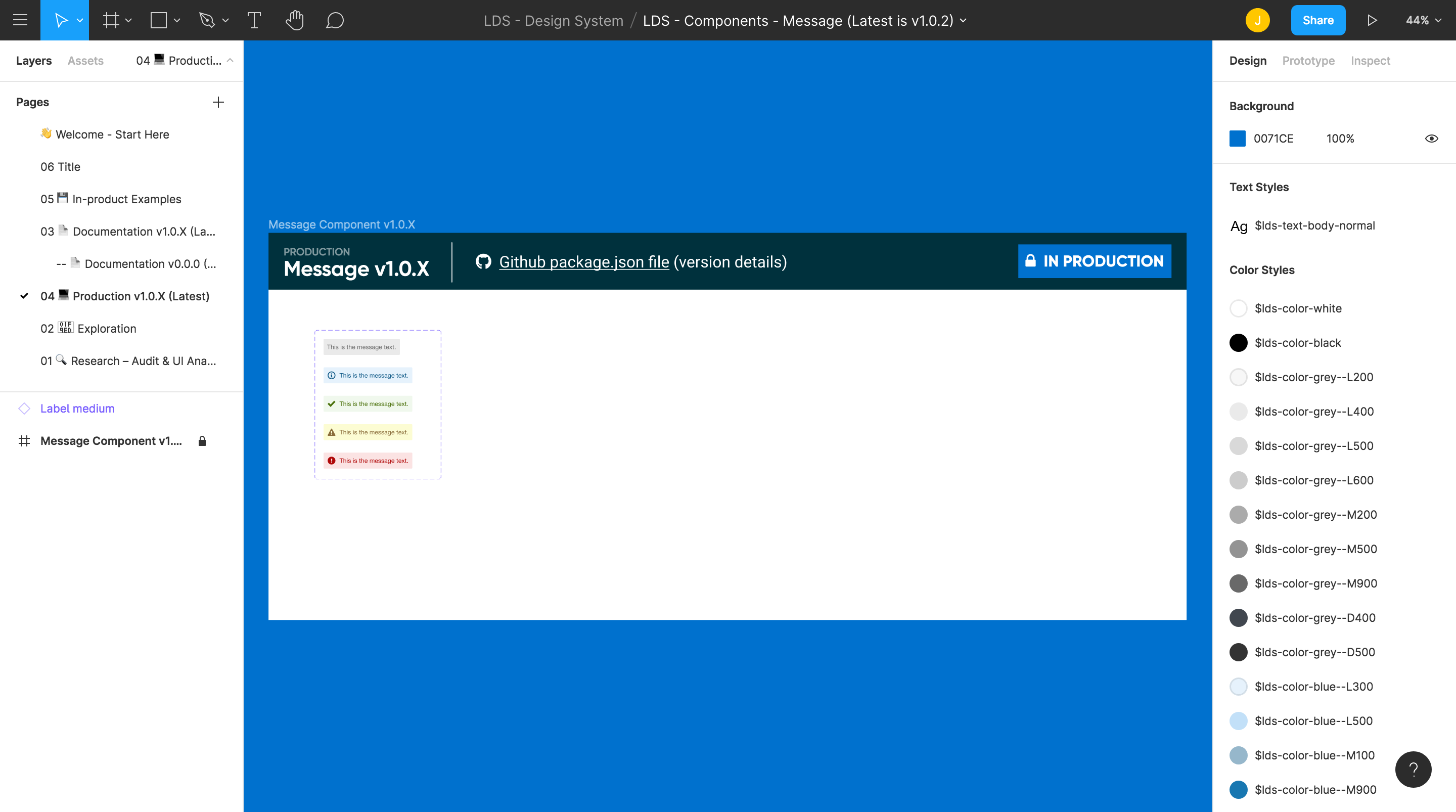
For the components we needed to consider how properties that we defined for a button for example, like states, would impact other components down the line like toolbar buttons, or buttons within other components. It was key to make sure anything we defined was accessible and consistent.
Currently the work to get legacy code bases to be able to consume the design system is moving along and the design system foundation work is getting used in or referenced in all of the existing products.
Learnings and reflections
Resources online were invaluable to this process. A video from Credit Karma, available on Youtube here, showcasing their design file structure helped us set the foundations for our own files and from there we could make changes and decisions based on our unique needs.
Working on this project gave me an in-depth look at how design systems can work and how it is possible to get one started with a collaborative team and by engaging stakeholders early on.
I learned a lot about process development and file management, setting up and using Figma for our systems design files, and working with developers to define and build tools that will be used by us both—such as design tokens and our Storybook component library.
On top of the amazing insights from my colleagues, I was also able to leverage the excellent resources available online such as Nathan Curtis Eight Shapes Medium articles, the Design Systems slack channel, and other design systems leading the way.